Another concept, another request for feedback…
4 minute read
August 12, 2012, 11:49 PM
So I took the concept design that I showed you about a week ago back to the drawing board and made some changes. This is actually both a step forward and a step back in the progression of things. While this design builds on the earlier design, it actually throws out the theme work I did in the last design. The earlier design was a completely new theme, while this one I’m about to show you directly modifies the current production theme. The reason for throwing out the newer theme was because I had so many problems with it. That made throwing it out worthwhile. Dirty little secret: some of the details in the other theme were fudged with a graphics program, since I couldn’t get the CSS to work out the way I wanted.
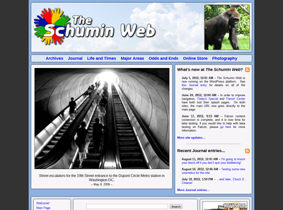
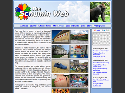
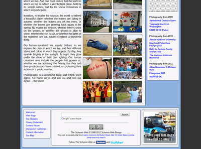
So here are the screenshots:
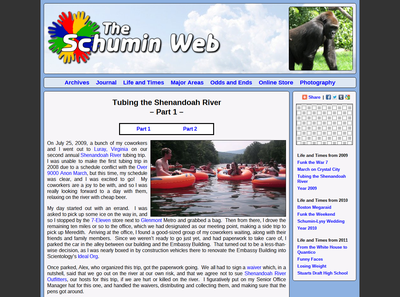
Life and Times set: Tubing the Shenandoah River
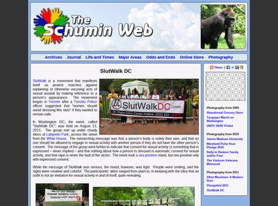
Photography set: SlutWalk DC
Now there are a few things I want you to look at and a few things I want you to ignore. First, please pay attention to the color scheme. I’m trying another blue color scheme, and need to know if this is a winner, or if something closer to some of the color schemes used in 2000 and 2001 or possibly the “Magic” concept would work better. Please also consider the header layout. I have enlarged the header considerably, and moved the splash photo into the header. The splash photo’s being on the Welcome page is just a holding pattern to prevent discontinuation of the feature while a redesign was underway. It was always my intention to move it in a redesign. The gorilla, however, is an inside joke. When I was younger, my parents would see a picture of some sort of ape in print and say to me, “How did your picture get in there?” Thus the gorilla is a nod to that. Then I want you to look at the footer. That is very much redesigned, and it needs feedback. And then please look at the font, which is slightly different. Rather than Arial, this new font is “Arimo”, which is part of the Google Fonts collection.
Meanwhile, I want you to ignore the logo. That is a concept logo that I’m probably not going to use, which I previously hauled out for a concept that I demonstrated last year. I use it here only because it’s not my regular logo. Also, please ignore the elements in the sidebar. The square pattern is in the sidebar boxes just because I don’t want to design any new boxes until I’m settled on what things are going to look like. This is enough to fill the slot for now. Also, please ignore the ad in the footer. I’m not far enough along in the process to use a live ad, and the fake ad I’m testing with is poking fun at the Navistar Champion bus fires.
So all in all, I think this theme has potential. However, I see a few problems with it. First and foremost, there’s no obvious space for an ad at the top of the page “above the fold”, as they say. The sidebar is a potential place to put an ad, but then the Main Page doesn’t have a proper sidebar, and the Major Areas page (not demonstrated here) also has no sidebar. So that seems to eliminate that on account of not being consistently implemented. My philosophy on advertisements is that the page design comes first and foremost, and advertisements should be elegantly integrated into that design without breaking it or otherwise looking awkward or forced. I fear that with this design as it stands, any attempt at inserting an advertisement above the fold will make it look very forced. And that is not, as radio personality Chris Core might say, a core value.
Now that this concept is out there, though, I want to hear your opinions on it. Please leave a comment below.
Categories: Schumin Web meta


