Lack of personality is a problem, indeed…
3 minute read
February 27, 2011, 2:38 PM
You may remember the site design concept that I tossed around about a week ago. It used a three-column layout, and significantly changed the above-the-fold look of Schumin Web.
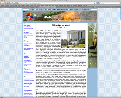
Since I doodled out a site layout with a Sharpie, I did go ahead and produce that hand-drawn concept using CSS, in order to see how it would look when built. Here’s version one:
This one implemented the layout as drawn, and was very conservative with the colors. The big changes were the introduction of a masthead, and moving the banner ad from the top to the side. Otherwise, all the graphics are stock, as the masthead photo is a slice of this photo of the JFK eternal flame, and the ad banner (which reads “Ride Metro, Have Minor Delays”) is derived from this photo. Then the logo, which no one has ever seen before, is a concept that I’m probably not going to use, but has value for this exercise because it’s not my regular logo.
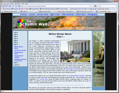
I asked a few of my coworkers about this design, and they were quite helpful about what I should improve. They suggested that I get rid of the squares and replace it with something darker, get rid of some of the white (and I agreed there was probably too much white), make the section-nav look like tabs, and streamline the sidebar. Fair enough. So that night, I went in and implemented a few of their suggestions. And I came up with this:
This concept had no white in it, implemented the dark background and darkened the colors overall, and fixed the concerns with the sidebar. Making the section-nav look like tabs was more than I wanted to build for a single-page concept design, and so while a final design might have it, it’s not going on for this one.
Meanwhile, one coworker of mine was able to articulate what I was thinking when it came to the concept. The pages were indeed nice looking, with their crisp lines and the like, but something was missing that I just couldn’t quite put my finger on. My coworker said it lacked personality, and that pretty much hit the nail on the head.
Think about it this way: It was my material, but it wasn’t “me”. It looks like my material just kind of got dumped into a generic blog skin. I’m sure this design would work beautifully for someone, but it just isn’t me.
This particular coworker suggested a caricature of me be worked in there, but I’m a bit wary about a picture of myself as part of the design itself. The last time I had a photo of myself built into the page design itself was in 2001 with the circles design, and there was an unfortunate case where the lighthearted photo of me and the more serious mood I was trying to convey in the quote article worked against each other, and I didn’t notice the unfortunate juxtaposition until that particular article’s run was nearly over.
So back to the drawing board, I suppose. But now I have something to chew on, and that is about how to make my personality show through. I think I got an unexpected insight into this when I went to Arundel Mills last night. I went to the Lego store, and sat down at the big round tables and went to work. I think I was probably the only person over the age of five at the table playing with the Legos. Sure, there were other adults there, but they were watching their children, and not playing with the Legos themselves.
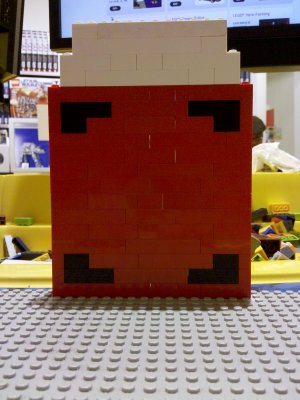
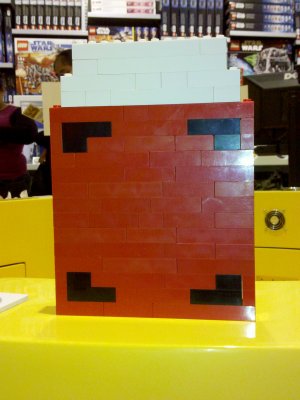
What I came up with was this:
That is a life-size Wheelock 7002T, made entirely out of Legos. Pop that little Lego strobe off of it, and you’ve got a Wheelock 34T.
See, that’s the kind of thing I need to capture in a design. When I am just doing something for amusement, what am I doing? That’s what I need to look at. And meanwhile, it’s back to the drawing board for me…
Web site: Designing Websites with Personality
Song: Two April Fools' parodies of the classic HBO intro, by HBO: this one makes sport of it by adding lyrics to the words, and then this one does the whole song on the kazoo.
Quote: Of course, one of the challenges of reengineering Schumin Web is that, considering how large the site is, making it all navigate and work together gracefully. That's another kicker...
Categories: Arundel Mills, Schumin Web meta


