“Magic” is the latest concept…
2 minute read
July 24, 2012, 10:31 PM
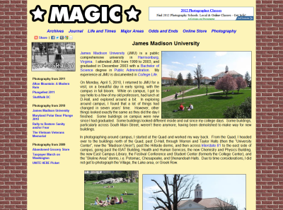
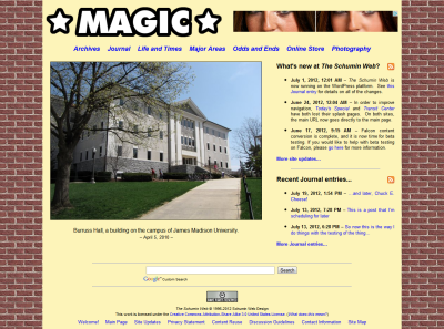
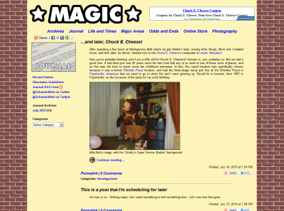
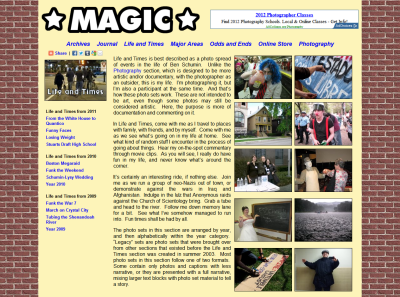
So I’m testing concepts in my sandbox site ahead of a full redesign. I want to see what I think of potential color schemes and potential new arrangements, and what others think about the same. So I put something together last night to see what it would look like. What I did was I went with a dark background color and put a light background behind the content. I also replaced the logo, mainly just to get my regular logo out of the picture (since I want to change it anyway). Nothing else changed. The layout is exactly the same. Just colors and the logo.
And here is the result:

James Madison University Photography set
For those wondering where the inspiration for this came from, it was a test stage at ShowBiz Pizza. The brick was inspired by the wall on Billy Bob’s stage, and the gold was inspired by the rain curtain on Rolfe and Earl’s stage (but is actually the same gold color used on this site from 2000-2002). Then why “MAGIC” in the place of the logo? Just a nod to the source of the inspiration, but it does test a potential logo concept. Don’t worry – I’m not renaming the site.
So let me know what you think in the comments below. Note that I am not necessarily in love with the specific colors nor the brick background. Think of the bricks as a generic background pattern, and the gold color as more of a generic light warm color. This is by no means the future of Schumin Web styling, but it’s worth exploring and seeing how it looks, and seeing what people think. After all, Schumin Web has looked more or less the same for nearly eight years. It’s time to rework things. And this is a start.
Categories: Schumin Web meta


