


Okay, folks, feedback time!
2 minute read
August 4, 2012, 9:30 PM
So I spent some time today playing around with a new theme for the site. Something on the way towards the ultimate goal: a new look for The Schumin Web after nearly eight years with more or less the same design.
In making this new design, I put what I had been throwing around for a while in my head into Dreamweaver to see what it would look like. And this is what I came up with:
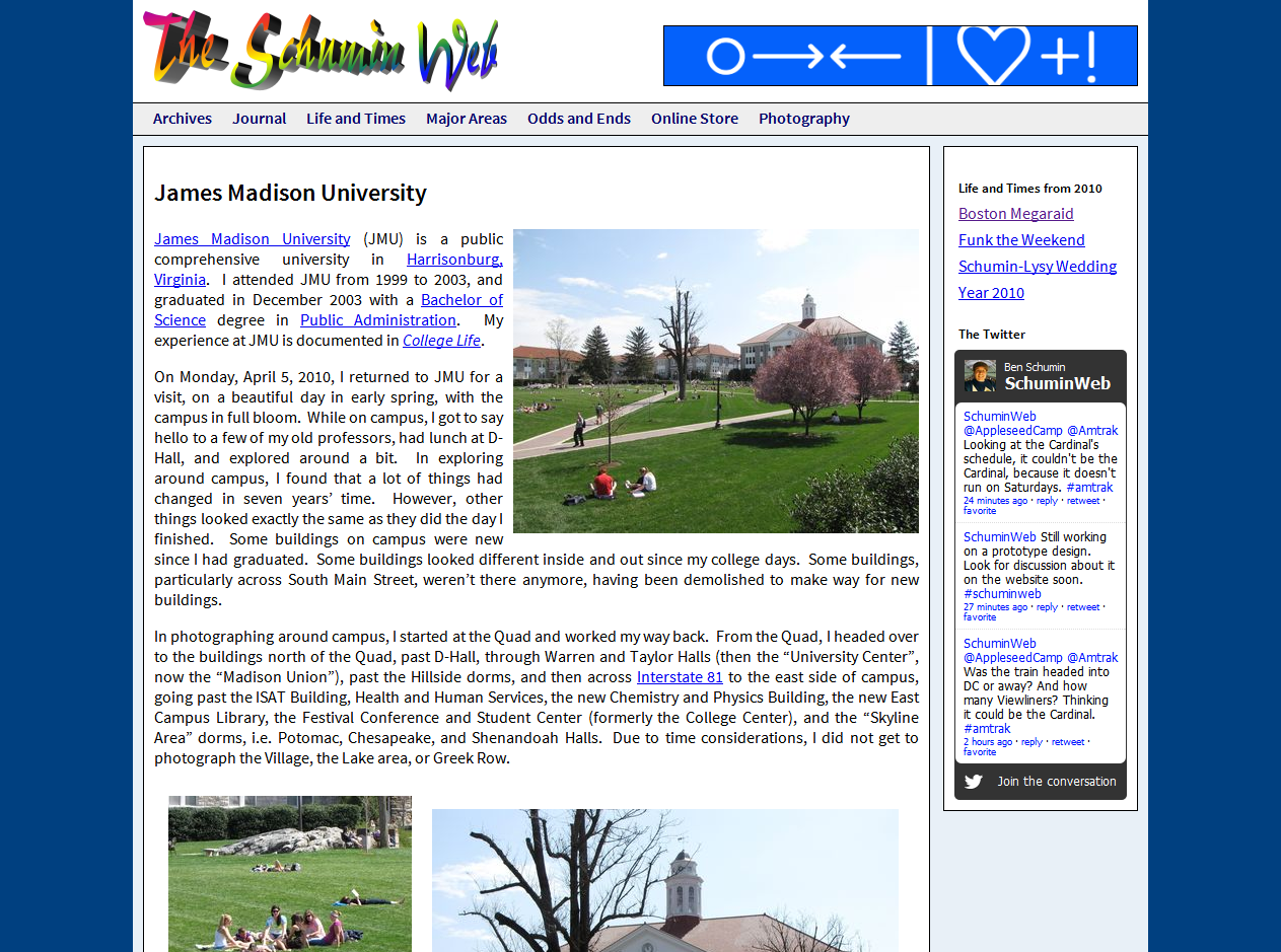
“James Madison University” Photography set
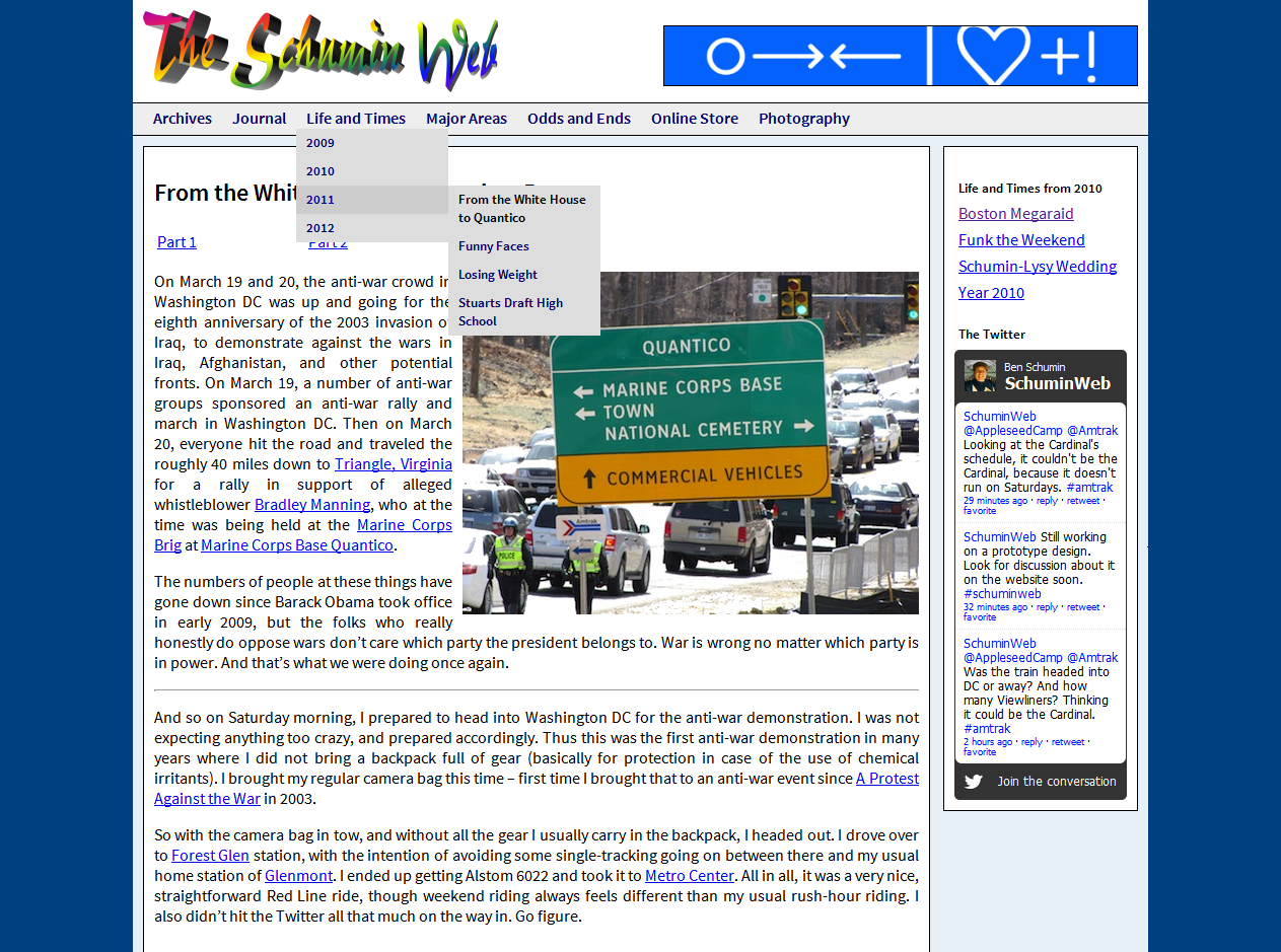
“From the White House to Quantico” Life and Times set, showing fold-out menu
Now please note, as was the case with some concepts that I discussed last year, that these are internal pages. A potential Main Page design is not represented here. The way I see it, more than 99% of the site will look more like this, and the Main Page is less than 1% of the website. Thus if I get the regular design nailed down, then I can design a Main Page. So right now I’m not thinking about the Main Page. That will come in time.
In evaluating this design, I want you to consider only the layout. I want you to look at how things fit together and relate to each other. Does putting the different areas in blocks “work”? What do you think of the fold-out menu? Where would you put the advertisement? I specifically do not want you to consider the header design, since it’s completely generic just to have something there, and I anticipate that my logo will change with this redesign. Likewise, please don’t consider the color scheme or the font choice. Unlike “Magic“, which specifically tested colors, I just pulled those colors out of the air, and I anticipate that the final color scheme will be quite different from the current site. Similarly, the font is just a Google font that I picked because it was a sans serif font that wasn’t Arial. So basically, I fudged a number of details here since it’s just a concept, and I know what I don’t want you to consider.
So I guess what I’m ultimately looking to find out is whether or not it’s worth pursuing this design further. Is it worth fleshing out more details here and refining things, or should I go back to the drawing board? Yes, right now it looks really sterile. But do you see potential? Let me know. Leave a comment below. Make my cell phone go off (since posting comments rings my phone). Ask me questions. Criticize my design. And don’t pull your punches, either. If you think it sucks, I want to know that, but I also want to know why you think it sucks. Likewise, if you think it’s awesome, I want to know why you think that. So let’s have a conversation.
Categories: Schumin Web meta