


Upscaling the potato…
40 minute read
August 30, 2025, 12:19 PM
Recently, Adobe introduced a beta version of Photoshop that contains an upscaling feature that uses generative AI. The promotional graphics for it were pretty flashy, showing that you could upscale an image to make it much crisper:

Image: Adobe
Based on the graphic, this new feature seemed pretty promising as a way to enhance older images. For those not familiar, my first few years of digital photography consisted of images that one could easily describe as “potato quality”, i.e. images that are so low quality that they look like they were shot with a potato. Back then, I used a Sony Mavica FD73, which saved images at a 640×480 resolution to floppy disks. The images were really low quality by modern standards, but at the time, it was considered acceptable. I made good use of this rather primitive camera until I got a Sony Mavica CD400 in late 2002, which I have referred to on here as “Big Mavica”. Big Mavica, unlike my original Mavica, shot images onto mini CDs, and the image quality was far higher – well out of “potato” territory. Then in early 2004, I got my first camera phone, an LG VX6000, which, because of the form factor, was able to go a lot more places than Big Mavica could go, but the photos that it produced were potato quality – even more so than the original Mavica, despite shooting at the same 640×480 resolution.
This whole idea of AI upscaling captured my interest, and so I figured that I would take it for a spin and run a few images through the grinder to see what would come out. I took a pool of twenty images from 2000 to 2006 that were originally shot in 640×480 and ran them through a gauntlet of sorts. I ran them all through Photoshop’s generative upscaling tool, and then I also ran them through through ChatGPT with its own image upscaling feature, and Google’s Gemini chatbot. In both of those cases, the prompt was simply, “Upscale this image.” I tried to invite Meta AI to the party as well, but Meta said that is not capable of upscaling images at this time. Then as a control, I also upscaled the images using the “smart size” feature in Paint Shop Pro 7.04, a program that was released in 2001 (where anything resembling AI was still firmly in the realm of science fiction), and which I used for most of my photo work until early 2024 when I finally graduated to Photoshop. I have published some of these images in various places before, while some others have never been published before. These photos were processed directly from the originals, i.e. any cropping and/or other editing that may have been made in previously published photos will not be reflected here.
So let’s get started. Like always, the images shown directly on here are sized down for presentation purposes, and then if you want to see the full-size images, click or tap on them to pop them up.


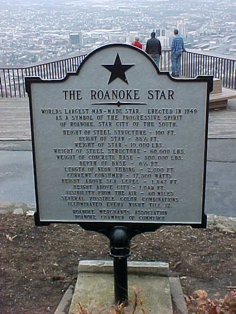
This image depicts the Roanoke Star on the evening of June 15, 2002. The original is on the left, and the control image, upscaled with Paint Shop Pro 7 to 1920×1440, is on the right. It was taken with the original Mavica, right after the star had lit up for the evening. It appears as the second photo in the sunset page of the Roanoke Star photo set.

This is the upscaling as completed in Adobe Photoshop. This was typical of the Photoshop upscalings, where the image details were not changed in any way, leaving it still looking like the original. The quality is still that of a potato, but compared to the control image, the background of the sky is much clearer looking, with none of the graininess in the control.

This is the Gemini version of the star photo. Gemini added some space above the star that was not in the original photo, and made the neon sharper than it was. The sky is less grainy than the control, though less so than the Adobe version. However, it did eliminate the breaks in the neon that were in the original photo, making the neon largely continuous, which is not accurate. The end result is still potato quality, though perhaps coming from a slightly better potato.

ChatGPT, meanwhile, reproduced the image in far higher quality, resembling a fairly well-known shot of the Roanoke Star that I took a few years later with Big Mavica. It changed the aspect ratio of the image, cutting off the space on the sides and leaving the edge out of frame, while generating more image above and below. I was impressed with the accuracy of what it generated below, as it was pretty accurate. Compare to an aerial photo that I took of the star last year that shows the structure beneath the neon. The only thing missing is the marker in front, but that can be forgiven, assuming that this was taken closer in.
The next photo is a previously unpublished shot of the Sheetz store on University Boulevard in Harrisonburg:


Original and control images of the Sheetz on University Boulevard. I took this with the original Mavica on August 27, 2002. Presumably, I had gotten hungry and decided to walk down to Sheetz from Potomac Hall to get some late night eats. It was in a grouping of other miscellaneous photos from that evening around Potomac Hall as well as on my walk down to Sheetz and back, so apparently, I was just messing around with the camera that night as I went about things. I also got a photo of the price sign, which revealed that regular unleaded was $1.25 per gallon that evening ($2.23 per gallon when adjusted for inflation).

The Adobe upscaling was only a mild improvement over the control image, with a slight reduction in graininess.

Gemini again produced a reduction in the graininess of the image, though the grain takes a noticeable stripey form. Unlike the Adobe or control images, however, the word “Sheetz” is no longer readable on the canopy, and there is an overall reduction in the sharpness of the image.

ChatGPT, as was the case before, upscaled the image in much higher quality, and it largely looks like a Sheetz from this period would look like. It did take a few creative liberties, filling some spots on the building that were windows with signage, and replacing the word “Sheetz” on the gas canopy with “welcome”.
I admit that I threw a hard one at the various upscaling tools with this one. Low resolution and low light produced a potato quality photo that was extra potato-ey. The original Mavica was a fairly primitive digital camera, and while it did its best, I would have gotten better results if I had been using later cameras like Big Mavica or a smartphone.
Then the next photo is one that I took in better lighting conditions:


I took this photo on June 3, 2001, and it shows the price sign at the Shell gas station on Greenville Avenue in Staunton, Virginia. This was taken along with a bunch of other gas price signs in the Staunton area with the intention of using them for a quote article about gas prices in July 2001, but for whatever reason, I chose not to use this one. The quote article is kind of idiotic, and can be summed up as “Schumin is a cheapskate and doesn’t have a good understanding of what goes behind pricing decisions.”

Adobe’s upscaling of this image removes some of the graininess in the image, most noticeably on the sign panels and in the sky, but it also removes a small amount of definition in the clouds. The text that was readable in the control image remains readable. The quality is absolutely still potato, but a slightly less grainy potato.

The Gemini image cleans up the graininess a bit more than the Adobe version, however, unlike the Adobe image, it scrambled some of the text. The text describing the different grades of fuel is clearly something other than what it should be, and the “Self Serve” text on the same panel of the sign is a bit distorted (I think it says “Sell Serpo”?). The “ATM INSIDE” text is also a little distorted, though still legible, and the text that we can see on the KFC sign is a little bit “squidgy” as well (thank you, Elyse, for that term). It understood “Food Mart” and “Car Wash” pretty well, though.

ChatGPT’s upscaling of this image is really sharp and accurate. It looks like Staunton. The KFC looks like KFC, though it smoothed out the sheet metal cladding on the mansard roof (though in all fairness, this didn’t resolve in the control image). The text on the sign is largely accurate, with “Self Serve” and “Cash or Credit” coming through accurately. The small text on the sign, which was hard to read in the control image, is nonsensical, though it kind of has an idea about what it ought to say, though it still fails. The first price is described as “Plme [unintelligible] Ulmeeded”, the middle reads, “SUper Requiter”, and the last one is “Super Unheeded”. That last one could probably be used to describe some of the advice that I give, but that’s another matter entirely.
Next up, let’s look at one of my past cars:


I took this photo of my old Toyota Previa van on July 28, 2001 at Vienna station before starting what would turn out to be my first true Metro railfan adventure. I explored all over the system, visiting parts of the system that I had never seen before, and had a great time.

The Adobe upscaling is about the same as we’ve seen, as it removes some of the graininess in broad, uniformly colored areas of the image. The sidewalk and the parking spaces are much smoother, though with some loss of definition that is in the control image. The vehicle itself is just as grainy as before, but the grain looks a little bit different.

Gemini took some liberties with this one, as it shifted the subject down in the frame a bit, putting it closer to the bottom, and adding more sky above. I don’t think that it improves the shot, but actually makes it look worse, like it was taken by one of those people who puts the subject of their photo at the bottom of the frame. I have never understood people who do that. Put your subject in the center. I make fun of those people, saying things like, “That is a very nice photo of the sky. Next time, get the people to move out of the way first.” Aside from Gemini’s poor form with photography, it also put a white stripe down the left side of the shot for some reason. The graininess, meanwhile, is no better than the control image, leaving it in potato territory, despite the larger frame size. It just generated more potato quality content to go with the original potato quality content.

Then there’s ChatGPT. The image looks pretty good. The Previa looks like it ought to. I really only noticed two issues. First, it scrambles the license plate, but that is barely legible in the control image. The only way that I know what the plate says is because I picked the message back in the nineties. The only other issue is that it wasn’t able to generate Toyota’s bull logo, either on the hubcaps or on the hood. It also tried to “fix” the missing hubcap on the right rear wheel. None of us have any idea how that hubcap got lost, but it did, and we never bothered to replace it.
Now that we’ve been in the Metro parking facility, let’s tap our SmarTrip card and ride a train:


This is a train of 1000-Series railcars entering West Falls Church station, traveling towards Vienna. I took it on the same day that I took the photo of the Previa.

The upscaling that Adobe did is still potato quality, but it cleans things up a little bit, removing some small amount of the graininess compared to the control image. All of the text that is legible in the control image remains legible in the Adobe version, including on the PIDS screen, as well as on the train and the wall.

Gemini cropped the image to eliminate the PIDS screen, which shifted the train to the right. I feel like it destroys the balance of my original shot, but I suppose that’s an editorial decision on the part of the AI. Compared to the control image, the Gemini image is not very grainy (though make no mistake, it is still potato quality), but none of the lettering is legible. The “|| ORANGE ||” on the train’s head sign is not visible in the control image so no criticism for its not displaying that. However, the “ORANGE” text on the card in the window of the bulkhead door is blurred out in this version of the image, and the text on the wall sign is scrambled.

And of course, ChatGPT, ever the overachiever, produced a pretty smooth image. No graininess, very smooth lines, and the text is… okay. It also makes a few mistakes on the details that don’t exist on the control image. The frames around the cab windows are the wrong color, because unlike the other car series, they were not black. Likewise, it took a few liberties with the bulkhead door compared to the original photo. As far as text goes, it filled in the head sign, displaying “32L9” on it. The wall sign is largely legible, except for the “A” in “UVA”, so not bad there. It also got the bulkhead door sign correct. The PIDS, however, which should read “ORANGE LINE VIENNA/FAIRFAX”, starts out with “DENSITY”, which is rather creative.
This next photo shows infrastructure:


This photo was taken on September 28, 2002 from the top of the George Washington Masonic National Memorial, and shows the southern end of Metro’s Yellow Line, with Eisenhower Avenue station near the right of the shot, and Huntington station visible in the distance.

The Adobe upscaling is exactly what we have come to expect of the Adobe version of images: a little less grainy in certain areas, but otherwise pretty similar to the control.

Gemini did similarly to Adobe: less grainy, but still potato quality.

ChatGPT actually got it right. All of the tracks are correct, even if the tracks themselves lack much detail (but the control image is pretty potato quality to begin with), and the details all seem to line up, with all of the buildings’ looking like they should.
The next image is a more detailed shot:


I took this photo of an ashtray outside of Potomac Hall on January 27, 2002, and ran it on a quote article later that day about the percentage of smokers at JMU. I wonder how the statistics compare now, considering that JMU has a stricter smoking policy, requiring 25 feet of distance between smoking activity and any part of a building, as well as the higher smoking age of 21, which restricts legal smoking to pretty much just seniors.

Compared to the control, the Adobe version cleans up some of the graininess, smoothing out both the sand and the butts a tiny bit.

Gemini expanded the photo on all four sides to some extent, particularly on the top and left sides. The original photo is largely unchanged, but noticeably cleaner, but with the loss of detail on the cigarette butts. Fun fact: the cigarettes with the orange filters are called “cork tips”, and are still designed to resemble cork. That detail that was lost was the cork design.

And then there is ChatGPT, which truly upscaled the ashtray and made this potato quality photo (which is surprisingly popular in the field) look more like something that I might shoot today. My only complaint is that it looks a tad too clean and refined, which is par for the course with AI images. Compare to the last time I shot an ashtray, in downtown Staunton in May 2021, which looks far more authentic, because, well… it is.
This next one has always been a favorite of mine:


I shot this image from the balcony of the Ocean Holiday hotel in Virginia Beach in the early morning on August 8, 2000, and it appears in the Sunrise at Virginia Beach photo set. Looking back at this old set now, as well as my later attempt in 2004 called Atlantic Sunrise, I am not particularly thrilled by either set as a whole, though each has a few individual shots that I like. This one, showing a man playing in the surf, has always been a favorite. I’ve said before that if I ever tried my hand at painting, that I would try to paint this photo.
This photo was kind of a disappointment overall as far as processing went, and none of the different AI upscalings did a particularly good job with it, so I’m going to comment on them as a whole. Here are the images:

Adobe image.

Gemini image.

ChatGPT image.
I wanted to see this one be upscaled and look fantastic, because I think that despite the potato quality due to the equipment that I was working with, it is a great shot. The composition is good, showing the man in silhouette just below the center of the photo, and the sunlit ocean fills the entire remainder of the frame, giving a sense of the vastness of the ocean. I was hoping for something that would resemble something taken with more modern equipment, like Big Mavica or my Nikon DSLR, but no – all of them were potato quality. Adobe smoothed out a lot of the details in the waves, making it less detailed than the control image, and Gemini produced a less detailed photo overall compared to the control image. Even ChatGPT was disappointing, bringing out no additional detail in the water and also giving the man a somewhat odd outline. I suppose that you win some and you lose some.
Now let’s try some people shots:


This photo appears in the Junior Year page on College Life, and was captioned, “Will and Clare from Campus Crusade for Christ have done an awesome job through the year with a community service project, taking out people’s trash throughout the building. We are highly appreciative of their efforts.” I hate that caption, because it sounds like something out of a school newsletter. During the time that I was using the original Mavica, I wasn’t particularly skilled about how to light my subjects, so having the people as the darkest thing in the shot was fairly common back then. I got better over the years as my technique improved with time.

The Adobe version actually isn’t terrible. Make no mistake: it’s still potato quality, but it eliminates a lot of the graininess of the image compared to the control, though it does sacrifice some detail around both of their eyes.

Gemini zooms the image in ever so slightly, and is similarly potato-ish. One thing that I noticed is that Clare’s eyes are slightly different in this version, being open a bit wider than they are in the control image. Surprisingly, it was pretty faithful to the printing on Will’s shirt, and didn’t distort it too badly (though make no mistake, it did distort it).

ChatGPT upscaled the image quite well, and fixed my bad lighting. There’s one thing that sticks out to me on this image. Look at their faces: they’ve aged! ChatGPT made them look like they’re in their mid thirties rather than college-aged. Additionally, while Will’s face looks like his own despite the passage of time, that is not Clare’s face. I don’t know whose face that is, but it’s not hers. Looking at other elements of the shot, the printing on Will’s shirt is spot on, while the design on Clare’s shirt, originally depicting a soccer ball and some text, with “SOCCER” as the second line, now reads, “GILISHOUS FUTUBE” (okay, then!). It also removed a curved glass-block wall that is behind Clare in the original photo, replacing it with a straight wall.
Then here’s another Potomac Hall shot:


I took this photo on October 28, 2000, and ran it twice in rather quick succession. The first instance was with a quote article, and then the second was on the Halloween page for sophomore year in College Life. It shows five girls dressed as fairies, standing in Potomac Hall before going out to party.

Adobe, as per usual, smoothed out some of the graininess as compared to the control image, but didn’t really do much else to improve the quality.

Gemini really blew this one. The quality is still just as potato-like as the control, but except for the girl in the center, now they’re all squinting.

ChatGPT, meanwhile, made a sharp looking image, but sacrificed their faces. Girls 1, 2, and 4 look more or less like the control photo, but girls 3 and 5 do not. Additionally, girl 2’s outfit was changed significantly, going from silver fabric to a plaid print, which lends itself more to “slutty Catholic school girl” than “fairy”. It also flattened out that signature Potomac Hall curved glass-block wall, and added additional glass blocks to the hallway. So while it certainly took some liberties with the subjects, it still ultimately captured the essence of the shot, even if it substituted a few of them for someone else.
Now, let’s go shopping:


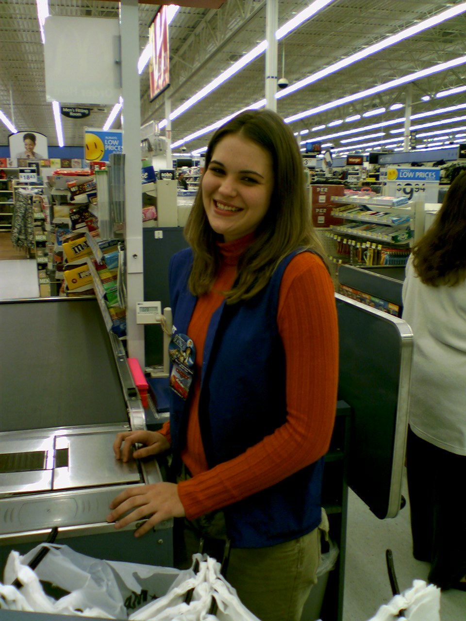
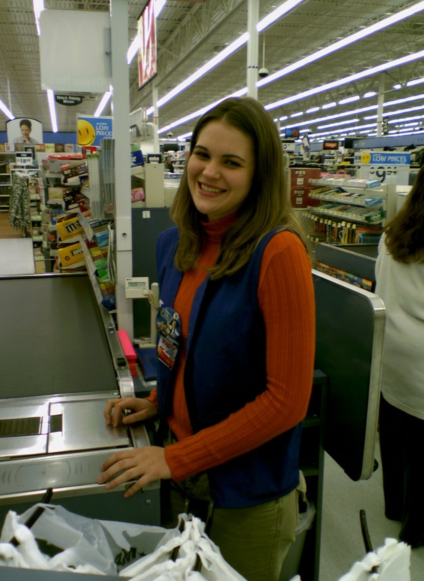
This is a photo of my sister from the original Wal-Mart photo set, which I did on June 9, 2000. This started out as something of a field test for my brand new Sony Mavica digital camera, and then when I got home, I realized that I had enough to do something with the photos, and made a small spread out of them for Schumin Web. I remember that a lot of people online made fun of this set when it was new, but they forget that its purpose was as a field test on a new camera. Looking back on the photo set, it depicts peak nineties Walmart, which is something that was remodeled out of existence long ago.

The Adobe upscaling smoothed out her skina bit, which actually was a little closer to real life, but it changed her lips ever so slightly. It also removed some of the JPEG artifacts, but left a lot to be desired. Definitely didn’t graduate out of “potato quality”. Not even from a regular potato to one of those big steakhouse potatoes. Just a different potato.

Gemini’s upscaling of the photo was still potato quality, but it also mangled up the text. Note the red sign at the top that says “TOYS” on it, and the “ROLLBACK” sign over the $2.97 price sign. Those are highly distorted, despite being legible in the control image. Also, that is not my sister’s face, now looking slightly towards the camera. I don’t know who that is that’s wearing my sister’s clothing, but it’s not her. It also smeared the logo on her shirt, which is supposed to be the logo for WQPO, a radio station licensed to Harrisburg, Virginia that brands itself as “Q101”.

Then there’s ChatGPT, which did a decent job upscaling the background, but failed on the signage as well as the human subject. The person in this shot appears to be in their thirties (look at their arms and hands), while my sister was 15 at the time. Additionally, that is wildly not her face, and the bot appears to have made her a bit heavier as well. I ran some other images of my sister through the grinder on ChatGPT, and based on those results, I am convinced that ChatGPT simply does not like my sister, as it made her heavier with every single roll of the algorithms.
Now let’s look at a detailed shot:


This is the right eye of Brittany Williams, who was a fellow RA in Potomac Hall with me during my senior year of college. We’re still friends, and she now has a very successful modeling career. I took this photo on October 17, 2002, as I was setting up for what would become the October 2002 splash photo. For a potato quality camera, this shot didn’t come out all that badly, as it captured a lot of detail in her skin, her eye, and especially the lashes. I’m kind of surprised that I never published this shot before.

I’m not sure what I think about the Adobe treatment of this shot. A lot of what I liked about this shot was the amount of detail on the skin and the eye, and this smooths things out too much, and eliminates some of the blood vessels in her eye. It looks a bit too clean, while still being potato quality (though this is probably the least potato-ey of the bunch).

Gemini did a quick crop on the image, but didn’t do much else with it compared to the control image other than slightly reducing the quality.

ChatGPT, meanwhile, did a proper upscaling. I am reluctant to say that an AI image is perfect, but it understood the assignment, and it made the original low quality shot look like it was taken with Big Mavica or another higher resolution camera.
That’s all of the images that I upscaled from my Sony Mavica FD73. The rest are from my old LG VX6000 phone camera. The device was newer than the Mavica, but while it shot at the same 640×480 resolution, the quality was lower overall, as the camera was definitely not this phone’s day job. This was the period when phones with cameras were still a new concept, and many new phones were still being sold without on-board cameras. So while the camera was there, it was more of a novelty than anything else at this point in the game.
The first one shows a subject that we all should be familiar with: a fire alarm.


I took this photo on August 22, 2005 at what was then the Coliseum Mall (now Peninsula Town Center) in Hampton, Virginia. I stopped by here because I had stopped in at some random mall to use the restroom on the way home from a photo trip in 2003, and never got the name. I really only remembered it for the Barnes & Noble store that I ultimately stopped at to use the restroom, and the Edwards fire alarm notification appliances that the mall had. I did some research on what I might have visited prior to my 2005 Virginia Beach trip (where this photo appears), and gave it a proper visit at that time. I had initially thought that this was the Patrick Henry Mall in Newport News, but nope – it was further along, in Hampton.

One thing that I noticed with the camera phone vs. the Mavica was that it was much less grainy. Despite being a lower quality image overall, there was less graininess in the final shots. The Adobe upscaling of this image reflects that. The quality is still that of a discount potato, but it’s a slightly smoother discount potato compared to the control image.

Gemini decided to crop this one differently, placing the fire alarm somewhat off-center, and added more window on the right side of the image, and more wall on the bottom. There is also an awkward black bar at the top. The lettering isn’t quite as detailed as on the control, and the yellow shirt in the background lacks some detail that the control image has. I don’t necessarily mind the off-center placement, though, because I will sometimes do that in my more recent alarm photos to create an alarm-watching-its-surroundings look of sorts (example).

The ChatGPT version, of course, looks super crisp, even bringing out details on the imperfections in the drywall. The fire alarm horn itself now resembles a Wheelock MT more than an Edwards Integrity, but the wider and flatter Edwards strobe is unmistakable (Wheelock strobes of the period tended to be narrower and projected out more). The “FIRE” lettering on the strobe is a bit off, though. It is bolder than the control image, but it also is off-center, being lower on the strobe than it probably should be, giving it an unbalanced look. Compare this strobe lettering to that of the Edwards 202-8A-101, which was manufactured with bold lettering.
Now let’s look at some transportation:


This shot depicts a Gillig Phantom in the back of the parking lot of the Walmart on Stream Walk Lane in Manassas, Virginia. The front wheels are up on some kind of wooden beam, perhaps to facilitate some work underneath. I took the photo with my phone on July 20, 2005. I found out later that this bus’s paint scheme indicated that it had previously served as a Dulles Airport parking shuttle. I have no idea what ever became of this bus after I photographed it. I also question why I photographed this with the phone rather than Big Mavica, because at the time that I took this photo, Big Mavica was in its bag, sitting right next to me in the car. This photo originally in the Year in Review photo set, which covered miscellaneous topics from 2005.

In the Adobe version, the upscaler largely smoothed out the parking lot, but not fully. Note that one parking space near the camera still has a lot of noise in it. The control photo has a lot of noise throughout the lot, likely coming from the physical texture of the lot itself. Why it missed this area, I do not know.

Gemini, meanwhile, did some mild smoothing on both the parking lot and the bus, and also did a weird crop on the image. Now the subject is not centered, and no longer has room to breathe.

ChatGPT’s upscaling of this image clearly thought that I should have used Big Mavica for this instead of the phone as well. I imagine that if I had used Big Mavica for this shot, it would have looked similar to this. ChatGPT actually made a really solid image here, and aside from its looking just a little bit too clean, I’m content with it.
Now, how about an early morning shot of a truck:


This is a Hypermart USA truck, photographed at the Walmart store where I used to work at in the early morning of October 1, 2005. For those not familiar, Hypermart USA was a concept store operated by Walmart as an early attempt to combine a Walmart discount store with a grocery store. Walmart ultimately passed on expanding the concept beyond the initial four stores, likely because it was too much at once for the shopping public. The company ultimately added groceries to their offerings via the Walmart Supercenter concept. This photo originally ran in the Year in Review photo set.

Adobe’s upscaling does about what we would expect of it, removing a lot of the noise from the uniform parts of the image, such as the sky and the pavement. However, there is no shortage of image noise, especially around the edges. Interestingly, it also distorted the “Y”, “E”, and “R” in “Hypermart USA” compared to the control image. Adobe’s generative upscaler has thus far shown itself to be the most conservative AI tool of the bunch, so its distortion of text came as something of a surprise to me.

Gemini’s take on upscaling this image is similar to Adobe’s in that it removed some of the noise in the image while maintaining the potato-like quality, but it also ground up all of the text. The only thing that is legible is “LESS” and “USA”, which makes the text worse than the control.

When ChatGPT upscaled the image, it created a very crisp image, as we’ve seen with other images. However, I was surprised that it turned out an image with a lot of noise in it. ChatGPT images are usually noise-free, but the entire image has a bit of graininess to it. As far as the text goes, it changed the font on the Walmart logo and the “HYPERMART” text, and it replaced the star in the Hypermart USA logo with a slash. It also generated gibberish for the tagline under the Hypermart USA logo. I was amused that it just said “LESS!” on the back (insert snarky joke about Walmart’s pay practices here), but to be fair, while the whole slogan was written on the truck, it didn’t come out in the potato quality original. Additionally, while it captured the essence of Walmart’s “Always” wordmark, it mangled up the word, writing “Humre” in the same style.
And on the subject of Walmart, here is one:


This is the original Walmart store in Staunton, Virginia, which closed in September 1995 when Walmart moved to a new Supercenter facility on Richmond Avenue. After a short stint as Sun Television and Appliances, the building, along with the rest of the shopping center, was bought by Federated Auto Parts, and turned the former Walmart into a warehouse. The photo was taken on April 25, 2005, and originally ran in the “Chucks, Metro, and Home Depot” Journal entry. If you want to see what this place looks like in better quality, I have also photographed it with far superior cameras.

The Adobe upscaling did a bunch of noise removal, but that was about it. I don’t like that it also wiped the clouds out of the sky, though.

Gemini altered the frame, which is apparently something that Gemini likes to do, as it expanded on the top, left, and right, while cropping out part of the bottom. It also distorted the word “Federated” on the sign.

The upscaling by ChatGPT made it look like it was taken with a modern camera, even if it is just a tad too “clean” looking. However, it also greatly modified the text on the sign. It changed the font to something pretty close to Helvetica, and then it also changed “FAPW” to “FARM”. Looking at “FAPW” in the control image, I feel like I’m biased because I know what it’s supposed to say because I’ve seen it in person, i.e. I am not relying solely on the information in the image to make a determination.
Now, let’s go to the mall:


I took this photo on October 14, 2004 at Tanglewood Mall in Roanoke, Virginia. This shows the mall’s JCPenney court, which is at the northeastern end of the mall. JCPenney is gone now, having closed a few years ago, and their building now houses a children’s medical office for Carilion.

Adobe did what it seems to do well, performing noise reduction. However, it also removed a lot of detail compared to the control image, such as the grout lines between the tiles in the bottom left of the image. It also blurred a separation between the ceiling under the second floor in the top left of the image and the side of the staircase. In other words, it took a photo that was crappy quality to begin with (though the composition is good) and somehow managed to make it even more crappy.

Gemini’s upscaling is better than Adobe’s (though make no mistake, it’s still potato quality), as it largely maintains things like the grout lines in the tile and separations between architectural elements. However, it also rotated the image counterclockwise by a few degrees, which messed with the composition, and not in a good way, making it look a bit more amateurish. It also took a few liberties with signage and customer traffic. In the control image, there is no visible signage at all for the storefront all the way left on the first floor. Gemini placed a sign over the entrance, filling it with nonsensical text. As far as customers go, I see two big changes. First, the guy wearing shorts and a hoodie looking at the art display has been replaced by a large individual who apparently has a mild case of rickets. Additionally, Gemini added two ladies near the stairs that don’t exist in the original image.

Then there’s ChatGPT, which upscaled it with a lot of detail. We have tiles. We have signage. It made the storefront on the bottom left into an empty storefront. I couldn’t tell you what, if anything, was in it at the time, so I’m giving that a pass for lack of information. However, I will ding it on the JCPenney logo, though, because while it’s mostly correct, the “J” is wrong, being a tad too narrow. Compare to an exterior logo on the Tanglewood store, taken with Big Mavica the year before. I feel like ChatGPT should really know what the Penney’s logo looks like, because it is a very common brand. It also removed a barricade from the left escalator, and replaced it with a small table, and also eliminated the leftmost handrail on that same escalator. As far as people go, it removed two shoppers that are way in the back to the right of the escalator in the control image, and also eliminated a person whose left arm and purse are visible in the edge of the shot. The lady in the pink made it through, as did two shoppers behind her who were walking towards JCPenney, though the guy on the left probably should get that grapefruit-sized growth on his calf looked at. Most interestingly as far as people go, the dude in the shorts and hoodie that was looking at the art display is now a woman. But all in all, it looks like Tanglewood, even if some of the details are off.
Now, let’s go to the other end of Tanglewood:


I took this photo on the same day as the other one, showing a single-story corridor that extends southwest from the end of the main portion of the mall. I published it as part of the Random Encounters photo set. Unlike the rest of the mall, this section had low lighting and a silvery, highly reflective ceiling that consisted of narrow slats. When I was familiar with it, the wing was largely dead, with no tenants except for maybe a police substation somewhere in the back. The corridor was eliminated a few years later in favor of a new, larger Stein Mart store, so it’s possible that the deadness of this wing was because the mall was running out leases in this section ahead of the reconfiguration of that part of the building. Relative to the rest of the mall, if you look at this panoramic image of the mall from 2014, Stein Mart’s mall entrance is in the same spot as this corridor was. My photo is the only one that I have ever seen of this part of the mall, and no one else on the Internet has seen anything else, either. So I suppose that despite its very potato-like quality, it does have some historic value to it.

Adobe, as usual, took a very conservative approach, removing some of the noise in the image while leaving most of the details intact. It turned the square tiles into stripes, but overall, it did create a slightly clearer product compared to the control image. So that’s something of a win.

Gemini got a little bit creative with this one. It left the stripes of noise that exist in the original photo, and the tiles are generally defined on both their X and Y axes, but it added a lot more ceiling to the top, putting the back of the corridor in the center, rather than the original positioning, which I feel looks more natural. It also added a second bench and put some random bald guy in it, and neither of those things existed in the original shot. Go figure, I suppose. Still unquestionably potato quality, but with a few liberties taken in the process of its upscaling attempt.

ChatGPT, you little show-off. This image is nearly perfect, looking like something that I might have taken had I felt comfortable photographing with Big Mavica rather than just using my phone. It’s still a little grainy, which befits the low lighting, and all of the architectural details are there. The slatted ceiling is not really defined, but in all fairness, it doesn’t resolve very well in the control image. The only thing that I really question is the people on the bench, as it replaced both of the men sitting on the bench. The one closer to the camera is wearing a different outfit and now has a full head of hair, while the other guy is now a woman, and her face seems completely distorted, and looks like she’s wearing a protective visor down over her face, kind of like some people were seen wearing during the pandemic. Definitely an odd rendering by the AI, that’s for sure. But other than the people, I was pleased with it, and it lends some definition to a really low-quality photo of something that no longer exists.
Now let’s try some deliberate people shots:


This photo was taken at the Video Zone arcade in Staunton Mall on February 20, 2006, and it depicts Jessica Siple playing Dance Dance Revolution. It appeared in the Staunton Mall photo set.

Interestingly, the Adobe upscaling of the image is unchanged from the control. Just as much noise, and just as low of quality.

Gemini made modest improvements over the control, removing some of the noise in the image (but not a whole lot). Gemini also expanded the image on the left and the bottom, adding some additional floor next to the DDR machine on the bottom, and adding another arcade machine to the row on the left side. Still potato quality, though.

ChatGPT did a pretty good job with the upscaling. It gave Siple a face, as her face is completely washed out by the light from the screen in the control photo, and it cropped the sides more to eliminate irrelevant portions on the left side of the image. It also added more space to the top and bottom. Despite these modifications, though, it maintained a good composition, keeping Siple in the center.
And lastly, one more people photo:


I took this photo on May 29, 2004, and it depicts a girl sitting on top of a Puma duffel bag and smoking a cigarette in front of Union Station in DC. It appeared as a photo feature on September 10, 2006. It was considered notable at the time for being the first phone shot to run as a photo feature. Phone photos in general were quite rare as photo features until around the middle of 2012.

For those not familiar with Union Station, at least during this period, nothing around that building was particularly clean. The sidewalks and other surfaces were filthy, with all kinds of dirt and debris on the sidewalk that left all kinds of fun patterns. The Adobe upscaling interpreted the filth on the sidewalk as noise, and cleaned much of it up. It created a much less authentic looking photo compared to the control image, as the sidewalk and other horizontal surfaces look too smooth, and it didn’t quite know how to handle the change in the sidewalk’s color, which led to an awkward color shift near the expansion joint. So in this case, a photo that was potato quality to begin with goes from being a Whole Foods potato to something more like a Food Lion potato.

Gemini, unlike Adobe, preserved the grittiness of the setting, keeping all of the sidewalk grime intact. However, look at the girl. She is the same from the waist down, save for some distortion on her left foot, and the bag that she is sitting on is the same, save for some distortion on the “PUMA” text on the side (this text isn’t obvious in the control image, but it is there). But look at her head and her arms. That is not her face, and her arms are in a completely different position than they are in the control image. In the control image, she is holding a phone in her right hand, and smoking a cigarette with her left hand. In the Gemini image, her head is angled slightly upward, and it is a different shape, and she has a weird growth going on beneath her ear that she should probably get looked at. Meanwhile, her left hand is now holding her chin, and her right arm is largely out of view, with only a little bit of it visible beneath her left elbow. This one gets mixed reviews, for sure. The image is still potato quality, which we’ve come to expect from Gemini at this stage, and it maintains the grit. But it fails big time on the person, because that is an entirely different face and positioning.

ChatGPT’s upscaling is once again quite elegant, as it makes this shot look like it was taken with Big Mavica or another more modern camera. It maintains the grittiness of the setting, as the sidewalk is indeed nasty, with lots of grime where it appears in the control image. It changed the aspect ratio of the shot, going from a 4:3 aspect ratio to a 2:3. As such, it cropped out some of the ledge behind the girl, as well as some of the sidewalk in front of her, and generated more sidewalk at the top and bottom. So far, so good. However, on the girl herself, it once again changed her materially. That is not her face, and she also isn’t smoking anymore, as the hand that originally held a cigarette now holds nothing. Also, if you look carefully at her left foot, she has six toes, as her middle toe appears to be bifurcated.
So now, after having evaluated sixty different images that come from three different AI tools, what conclusions can we draw?
First of all, Adobe’s tool shows some level of promise, even if it very much underdelivered. It was the most conservative with the generative features, making no material changes to any of the shots. And for a tool that comes with the Photoshop application, we want a very conservative AI that attempts to enhance the shot as it exists, because small changes can make a big difference in the tone of the shot. This is not Photoshop’s first foray into generative AI, as the program already uses generative AI with their “remove” tool, which is a point-and-click tool that will remove targeted elements from an image. I’ve used it plenty of times without comment, and it works very well. For instance, in this recent photo feature showing the Holland Tunnel, I used the tool to remove the hood of my car from the bottom right corner of the shot. Likewise, in the Journal entry where I talk about unnecessary redactions, I rather shamelessly used Photoshop’s remove tool to quickly extricate Elyse from the two shots. Just circle the unwanted element, and zap – it is gone. This tool is clearly in beta, and with further refinement, I can see its being quite useful. One thing that’s worth noting, though, is that the tool currently will not upscale anything that will result in an image that is larger than 4096 pixels. That means that anything Big Mavica’s resolution or larger is out, but anything taken with the original Mavica, or with a pre-smartphone cell camera will process. I suspect that limitation is for purposes of the beta test, but who knows. Part of me wonders if Adobe’s AI upscaling feature is more properly marketed as an AI noise removal tool, since it appeared to do a decent job with noise removal more than anything else, and didn’t really improve the quality of the images themselves over the control images. This is a newer tool than the others, and is aimed at professionals in the photography world, so this seems like one to watch, even though right now, it doesn’t do a whole lot.
The other two tools, meanwhile, produce a somewhat better result than Adobe, but also tend to take more liberties. ChatGPT unquestionably produces the sharpest images out of the bunch, as it scales up the images and gives them that signature just-a-little-too-perfect AI look. However, the service also fails when it comes to faithfully upscaling certain elements in the images that it is given, specifically faces and text. I am told that this is because ChatGPT does not directly upscale the image, but rather, it generates a similar image on its own using the provided subject photo as inspiration. If you’re trying to upscale an image of a recognizable person, you will probably be disappointed with what ChatGPT outputs, since the faces that it generates don’t really line up with the faces that it generates in response. Out of nine recognizable faces, it materially changed four of them to the point that it is someone else’s face entirely. And text is kind of a roll of the dice, as it can successfully recognize and duplicate big text that is easily read, but it fails on smaller text. I have never seen “DENSITY” on a WMATA PIDS screen before, for one thing, nor have I ever seen a grade of gasoline called “Super Unheeded”. But if it doesn’t have recognizable people or signage in it, ChatGPT is a pretty solid upscaling tool. I was genuinely impressed by the upscalings of the Previa (minus the license plate), the Yellow Line tracks, the ashtray, Brittany’s eye, the Gillig Phantom, and the dark corridor at Tanglewood.
Gemini, meanwhile, I can’t say that it would be my first choice in an upscaling tool. It tended to generate lower resolution images than Adobe or ChatGPT, and it almost always butchered text, even if it was very clear in the original image. It also tended to do some rather odd cropping, destroying the composition of several of the shots. However, unlike ChatGPT, I felt like it was a little more faithful to the original images, with fewer liberties taken – for the most part. After all, let’s not forget the smoker on the sidewalk and her completely different pose. So I guess that you could call the Gemini upscalings respectable, but not great.
I also learned that with Gemini, it doesn’t treat these image upscalings as individual subjects, and thinks about all of them together in series. I had to initiate a new conversation with the chatbot for each individual image to get the result that you saw, in order for it to consider only the one image. With ChatGPT, it evaluated each image individually, despite being in the same chat thread. When I did that with Gemini, I got some wild results. Here’s some of what I got before I stopped:


Both of these were from the photo of the Sheetz in Harrisonburg. I ran it twice, because the first one produced something resembling a Shell station, and then only the second time did it produce something resembling a Sheetz.

In the fairies photo from Potomac Hall, it didn’t do a terrible job if you don’t consider that this bears very little resemblance to the original photo. After all, none of those girls appeared in the original photo, and it added a sixth girl who wasn’t in the original shot.

This is the fire alarm from Coliseum Mall. When I told it to upscale this image the first time, it output the previous image. What you see here is what I got when I rolled it again with the same image and the same instruction. It’s actually higher quality than what Gemini spewed out when I ran it in its own separate conversation, though the composition is a little bit wonky, with it skewed right and angled down. And it still can’t decide whether it wants to be a Wheelock MT or an Edwards Integrity, as the bottom of the horn is more Edwards-like, while the top is more Wheelock-like.

This is how it interpreted the photo of the dark corridor at Tanglewood Mall. None of this appears in the original photo. No girl talking on two phones at once, and that is an entirely different hallway.

The one of the smoker girl at Union Station was interesting, though. When I ran her through Gemini the first time, it gave me whatever subject I ran through the previous time. So I ran it through again, and I got this image. Gemini took quite a few creative liberties here, as the angle is different (my photo was closer to level), and the girl has turned to the left and is now taking a puff on her cigarette. I don’t hate it, but it’s not the original photo by any means. If I didn’t know better, I would think that this was taken shortly after the other photo, being the same (potato) quality and all. The only thing that really gives it away as AI is her left foot, as she is wearing flip flops, but has no toes.
Then, just for fun, I ran this version of the smoker girl photo through ChatGPT:

Yeah, okay, I couldn’t resist doing that.
But that little thing where Gemini remembers other photos and has to be manually cleared in order to evaluate each photo as an individual is kind of annoying. It’s nice to be able to just shotgun it like I did on ChatGPT. Whether that is considered a bug or a “feature” is up for discussion, I suppose.
One thing that I also considered as I was evaluating these photos was that perhaps a lot of what I was seeing was because these photos were just so low in quality that I was stretching the tools beyond their limitations. So I also ran a test on one photo taken with my second camera phone, an LG VX8300:
I took this photo of a coworker from my Walmart days on October 31, 2006. This is an alternate of another photo that I took of this same colleague with Big Mavica. It’s about four times the size of the others, at 1280×960. The control image was scaled up to 2880×3840, which is just shy of my current phone’s shooting resolution of 4000×3000.
The Adobe upscaling performed respectably, taking a conservative approach to upscaling. The photo is still about the same quality as the control, i.e. this isn’t ChatGPT and its too-perfect illustrations. It really does give me the sense that Adobe’s generative upscaling tool is probably better marketed as a noise removal tool, because while there are artifacts in almost all of the same places that there were in the control, certain elements, such as her eyes, lips, and teeth, have more definition in the Adobe image than in the control. Her hands also have a bit more definition to them in the Adobe image than in the control, however, it took an ambiguous light spot on her left middle finger in the control and enhanced it a bit, making it look more like a finger abscess. The tool also enhanced her shirt, with more definition in the vertical striping. However, it did smooth out many of the wrinkles in the sleeves, which makes it look less realistic as the striping becomes somewhat inconsistent in those areas. It also smoothed out the conveyor belt, which was not that clean in real life. The background, meanwhile, is a mixed bag compared to the control. Text elements largely have less definition, and other background elements have some modest improvement in the amount of image noise.
Gemini was largely a crop-and-process job, and ended up as a lower quality image than the control, with less definition all around, especially in the text elements. I was kind of disappointed with that result. I expected better.
ChatGPT really dropped the ball on this one. I would expect higher accuracy based on a higher initial resolution, but it left me disappointed because of background distortion and creative liberties. The background is largely inaccurate, as a lot of elements were distorted, especially signage. Also note that ther person on the sign in the extreme left of the image was changed from female to male. Otherwise, my colleague looks different, most notably her head. The person in the original photo had a somewhat small head. This person’s head is much bigger now, almost unrealistically so, and that is someone else’s face. Her left hand is also in a different position compared to the control. The only thing that I can really give it credit for is that it did a better job lighting the subject than I did, as the subject is somewhat dark in my original photo. I’m blaming the camera for that one, because the shot that I took with Big Mavica is much brighter.
So I suppose that is that. All of these different AI tools do different things well, and different things poorly. By far, the most conservative is Adobe (and for good reason considering its target market), while ChatGPT produces a much higher quality image overall, but is more likely to take some artistic license in the process, which could fundamentally change the character of the shot. Gemini seems to be a bit behind the pack in general, as its upscalings were usually a bit lackluster, with lower accuracy and image quality compared to the others, but I imagine that it’s doing its best based on what it’s working with, but it could improve with further development. I feel like the Adobe tool shows great promise, and I suspect that it will improve as it develops and reaches production. However, I fear that when this tool reaches production, it will be put behind a paywall as a premium feature and not be included with the regular Adobe subscription price. I probably wouldn’t pay for that, especially not in its present form based on the results that we saw here.
This entire experiment also gave me a renewed appreciation for the photos in their original form. They were products of their time – a period when digital photography was still relatively new, both in standard cameras and especially in cell phones. Most of these images were over twenty years old, and things have changed in that amount of time. The low quality is very much part of the memory, as far superior cameras have come along to take their place and produce higher resolution memories.
And that’s the state of things right now, I suppose. I would love to revisit this topic in the future and see what changes as technology improves.
Categories: Artificial intelligence, Photography
Leave a Reply