


A trip through Schumin Web’s “attic”…
8 minute read
June 28, 2016, 5:06 PM
First of all, for those of you who were not aware, Schumin Web recently moved to a more robust hosting plan with the same hosting company, after it had become painfully obvious that I had outgrown my existing hosting plan. This new arrangement will provide higher page load speeds for you, and more growth potential for me.
With that, I thought it would be interesting to look at what I’ll call “past futures”. I recently went digging around the folder where I keep a bunch of old graphics and such that I made for the website at some point or other, and was thoroughly amused by them. Some of this stuff actually did make it to the website but is now long gone, some of it was seriously intended for production use but wasn’t used, and some of it was more exploratory in nature with no real intent of actual use.
I currently have an online licensing portfolio through Pixels.com. That was not my first foray into photo licensing. In 2003, I made efforts to license my photo work for third-party usage as well, but with far less success. In that instance, I tried to go it alone, operating an independent stock photography website. I called that effort “Almond Street”. If I recall correctly, the name came from a thought back to the streets that I remembered from our time in Rogers, Arkansas. Many streets in Rogers were named for trees, so I thought of tree types that might sound nice as a brand name, and decided that “almond” sounded the best. What’s amusing in hindsight, however, is the logo:

That was my logo. That nut was my imagemark. It looks a little flat, but it was my own design. I came up with it by drawing an almond on paper with a sharpie, from memory, and then scanning it in. Recognizing that my drawing was lopsided, I then cut it in half and flipped it, making a decent enough looking almond. Here’s the evolution:


When you compare it to what an actual almond looks like, I think I did well enough. I don’t know if “stylized” is the word you would use for this imagemark, but that’s what it was. What did it have to do with photography? Nothing at all. However, when you consider my skill level with photography (look at 2003 sets in Photography for an indication of the quality) and other things at the time, I think that the branding should have been the least of my concerns.
I also came up with an ad to run on Schumin Web at the time:

This was the perfect fit for the time. Schumin Web was in between advertisers at the time. I had not yet gone with my current advertising company, and had recently dropped a company that, upon closer examination, required traffic the likes of which only sites like Google could obtain in order to pay out. I dropped them like a hot potato upon that discovery, and so during the interim while I had no real ad provider, I ran an ad for Almond Street. However, I similarly dropped the Almond Street ads like a hot potato as soon as I got a “real” ad network in place. You can see the Almond Street ad in the 2002 and 2003 versions of Schumin Web on the Historical Site Designs page.
All in all, Almond Street was a good idea, but it was too early, and needed far better product behind it. Nowadays, I know my “core business” a lot better, and know when to outsource functions to third parties. Photo licensing is a good example of when it’s smart to outsource the service to a third party.
Moving along, when Schumin Web turned 15 back in 2011, I wanted to dress everything up for that milestone anniversary. The logo got the “Celebrating 15 years online” tag (much like the current “Celebrating 20 Years” tag), I ran a cake for the splash photo, and I ran a Journal entry celebrating the event. The photo feature was normal, showing a photo from a recent anti-war event. But that wasn’t an oversight. There was a plan to put something special up for the anniversary, but it was never used. Here’s what I had come up with:

Basically, the theme was a collage of polaroids on a bulletin board, showing photos throughout the site’s history. I have photos from 2001 through 2010 on here. I selected 29 photos as finalists for this collage, and used 11. I’m pretty sure that my decision to not use this in the end was because while it looked nice enough at the full size of 1024×768, when reduced down to the then-current photo feature size of 550×413, it really deemphasized the empty brown space that is more apparent in the full-size photo, making it look more jumbled together than I wanted. Oh, well.
Of course, that was tame compared to other concepts that I wanted to try out for the anniversary. I also wanted to do something special with the logo for the anniversary, and that was also less than satisfying. The idea was to do the logo in a different color for the anniversary as something of a celebration. I think you’ll understand why I didn’t go with any of these:

That bottom logo, which I termed “crystal”, was the inspiration for these different concepts. However, that one is probably the worst looking of the whole lot of them. Looking at these today, I like that green logo (second from top), and I also like that crimson logo (second from bottom). In the end, I didn’t use any of them, and just as well. They all left something to be desired, and as I’ve learned over the years with previous efforts to update the logo, it’s really hard to outdo that rainbow logo and still be Schumin Web.
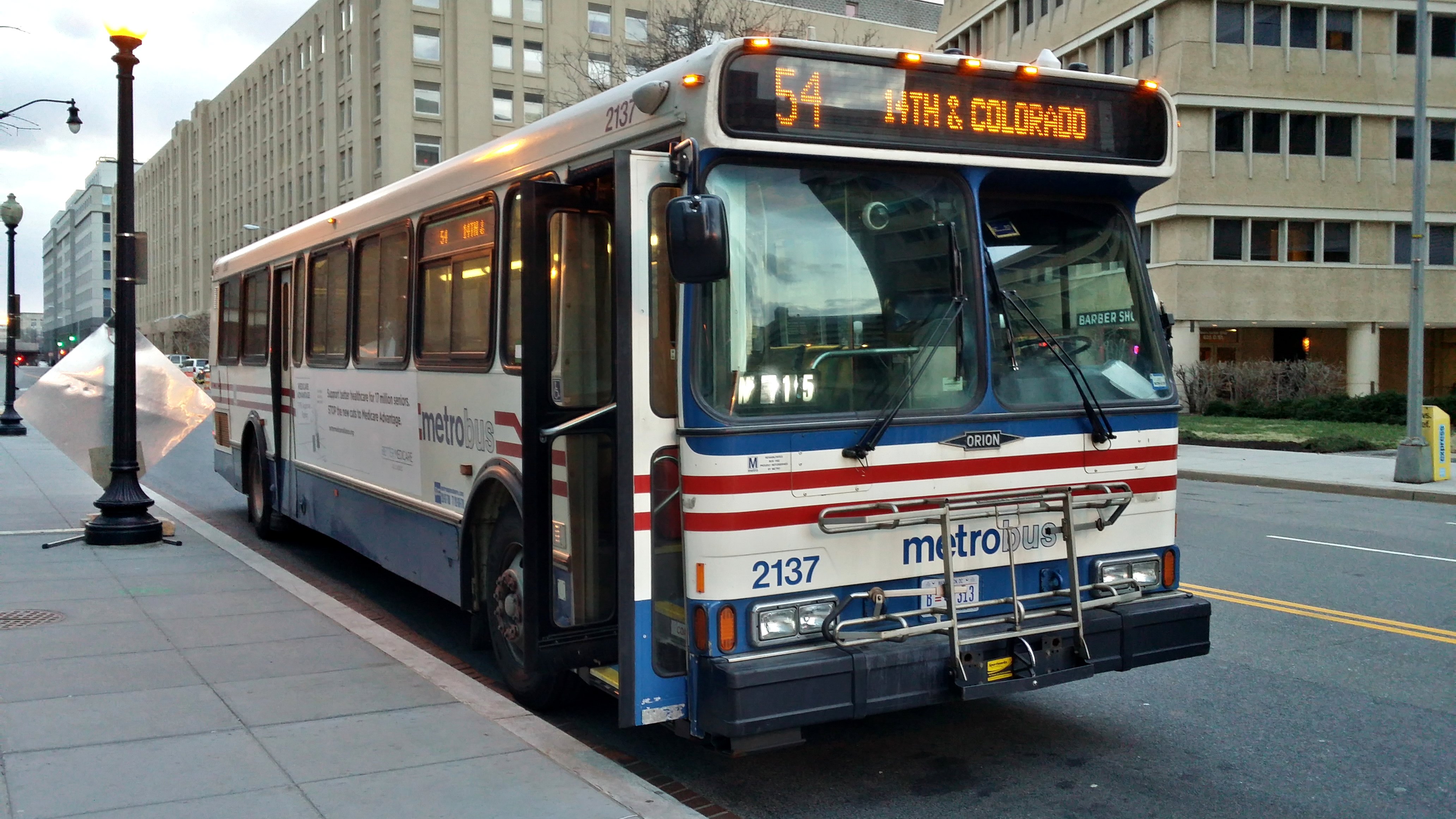
One of the more fun parts of running this website is when I have to create illustrations and/or diagrams for a Journal entry. Among other things, I’ve done a school bus turn illustration, some crazy PIDS displays, Dixieland Mall, the Potomac Hall fire alarm map, the lap lanes, and the voting lines. One diagram that I created but never used was one showing a proper transit bus stop, as part of the Journal entry about school bus stops that I did last year. There, I showed a photo of a Metrobus in position for a proper service stop. There was also a diagram that went along with that photo:

This diagram was perfect, because unlike most diagrams that I do, this one was to scale. One pixel equaled one square inch, and I researched all of the correct dimensions, including the size of an Orion V, and the width of the lanes. The diagram is supposed to be an overhead view of what that photo shows (note that in both cases, the bus number is 2137). I think that at the time, I lacked confidence on the bus’s angle, thinking that it was potentially too steep. Looking back, the angle was probably fine, but if I didn’t have enough confidence at the time to run it, then I made the right decision.
Then there’s this:

With this, I was attempting to do a spoof of the surprisingly controversial Starbucks holiday cups from 2015. It was an interesting idea, but it fell apart with the execution, to the point where I decided to abandon the idea. I ended up running a classic photo of me on Santa’s lap that month.
On the subject of website Christmas decor, even before the splash photo was introduced in 2002, I still decorated for Christmas. I came up with two concepts in 2001:

The photo that ran in December 2001 was the one on the left, showing me holding a “Fill ‘er up!” lawn sign. The one on the right, showing me wearing a set of reindeer antlers, was completed but not used. Back then, I liked the sign on the left enough to run it on the front of the site. Nowadays, I’m not sure that I would do that, as I now prefer the “antler” one because it looks a little less crowded.
And finally, I have a lot of transit-related fittings. Recall that for a little under ten years, I ran a site called “The Schumin Web Transit Center”, which featured photos of transit that I had taken. I retired the site in December 2013 in order to eliminate what might appear to be a conflict of interest as I was applying for jobs with several of the agencies featured on the site (and I do, in fact, now work for one of the agencies that was featured on the site). I created a bunch of Metro-related graphics, since Metro was always the largest section of the site, and here are a few of them. First, the flip-dot signage:


Then LED:


You know that these are old because we haven’t seen “ADDISON ROAD” as a destination in over a decade now, and “BRANCH AVENUE” now displays as “BRANCH AV” on all car series. Previously, Branch was spelled completely out on the 5000-Series, and “BRANCH AVE” on everything else.
These have come in handy over the years. Among others, I can think of one instance in 2005 when I ran the LED version of “NEW CARROLLTN”, one instance from 2007 when I used the LED Mt. Vernon Square, and another in 2007 when I used the LED “GLENMONT” and “SHADY GROVE”. Additionally, flip-dot “RED” came in handy for my train costume in 2008.
So there you have it, I suppose. Digging old stuff out of the files and sharing it is kind of fun, especially when enough time has passed that you’re able to laugh about it.
Categories: Schumin Web meta