


Trying out a third concept. Your opinions appreciated.
5 minute read
August 26, 2012, 12:36 PM
So I’m now on my third design concept. This one, as I kind of indicated before, I decided to finally design for a larger resolution, after about eight years of designing for 1024 pixels across. Now I’m designing for 1280 pixels across, and then I will use CSS to scale this down for smaller widths once I get the main design going. So here are some sample screenshots:

Archives main page.

Fire Alarm Collection main page in Odds and Ends.

Rally to Restore Sanity and/or Fear photo set.

Bottom of Vietnam Memorial photo set, showing page footer.

Main Page with horizontal photo feature.

Main Page with vertical photo feature.
Now I want you to notice a few things about this design vs. the previous design. First of all, the Splash Photo (the gorilla in the prototype) is now at a 4:3 aspect ratio rather than a 1:1. This will make production a little easier because it means less post-production work to have the same aspect ratio as comes out of the camera. Second, I went for more varied blues in this one, and no dark grays in this design. The color that I actually used as a base for all of this is Metro’s “Potomac Blue”. That’s this, for those of you who are unfamiliar. That color is the background color, behind everything else. Then all of the other blues are variations on the lightness of that initial color.
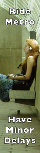
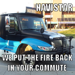
The main reason for this design over the last one is the advertising. The current layout, if it ends up going out looking like this, will use two ads on a page. One is a skyscraper ad above the fold, and the other is a box at the bottom of the page. And for design purposes, when I need ads, I pull out my dummy ads, as I feel it would be improper to use a live ad for a prototype design. I think I would describe my dummy ads as humorous, though slightly mean-spirited. There’s this one where I poke fun at Metro’s use of the term “minor delay”, and then this one where I make fun of the Navistar Champion buses, and their tendency to catch fire. Of course, these aren’t for normal use – just test purposes, but they are amusing enough to share.
Now one thing I’m not entirely sure about is the Main Page layout. I think it looks nice enough, but I’m not quite sure what I think about the photo feature being so far to the left. This is consistent with the rest of the site’s layout, as the content on the rest of the site is on the left side of the screen. However, with the Main Page’s larger menu panel due to the specialized content contained within it, it pushes things further left than on most pages. So I’m particularly looking for feedback on that. Note, however, that the horizontal and vertical photo feature now utilize the same layout, i.e. there is no more filler content for vertical features, as I feel that the new design makes this unnecessary.
Another question: do you think that the design is too blue? I experimented with a number of color combinations, but none of them pleased me. I always imagined a maroon design, but when that was put into the stylesheet, it was ugly. I mean really ugly. The only color I could get a nice combination out of was blue.
And then there’s the logo. I used the 2010 concept in the design again, but I will swear on a stack of something that the 2010 “Daisy Wheel” concept will not be the final logo. I have no idea what the final logo will be, however. It’s stumped me more than the design has. The design has started to come together quite nicely, but the logo really needs a lot of thought. I really want to change the logo, because I feel that after more than 13 years with the current logo, it’s time for a change.
It’s kind of funny how this design came about. My original idea was “wedges”, with one L-shaped wedge coming down from the top, containing the header and the sidebars, and then a second L-shaped wedge coming up from the bottom containing the footer and the content. Let me show you what I mean with these screenshots of the early design:

Now before you comment on the colors, be advised – these colors were never serious. When I’m designing, it makes things easier to make the colors of every div amazingly bold and contrasting from everything else. This way I can see exactly where the boundaries of these things land. But this is the general idea. One section comes down from above, and the other comes up from below, with something of a “swoosh” going between them. The design evolved away from this for two reasons. First, I didn’t like the fact that the inner corners were straight rather than curved like everything else. However, the bigger problem was what happened when the sidebar was longer than the content:

See the gap at the bottom of the screen? I tried for hours to make it work, researching techniques and experimenting, and I just could not get that content div to fill to the bottom of the screen using CSS – and I was not about to cheat on this one. It amazes me that I couldn’t get this to work, considering that I was able to reproduce the old splash page’s design using CSS in 2010. That was a vertically centered layout, and it was done entirely using CSS. But this task – no.
Thus the design evolved to what you see at the top. First the bottom wedge was broken up into two separate pieces, which rectified the immediate problem of the broken design, but then I had one continuous wedge and a broken wedge. That just wouldn’t do. Plus there was still that non-rounded inner corner in the one remaining wedge. So I broke up the other wedge to match, and I’m satisfied with that result, even if it wasn’t what I was originally going for.
So please leave a comment below and let me know what you think. And just saying that you like the fact that the square pattern is gone isn’t particularly helpful (and you know who you are), since that’s a minor detail that wasn’t even original to the current design.
Postscript: And I'm still amazed about how difficult this design process has been. I used to be able to design things in no time. I believe that the 2004 design (which is the origin of the site's current appearance) took about two hours to design. 2001, 2002, and 2003's designs took a similarly short time to put together. This is a lot more complicated, but I think it also advances the look quite a bit.
Categories: Schumin Web meta