


Playing with the AI image generator…
22 minute read
October 27, 2023, 10:02 AM
Recently, a friend of mine posted some computer generated images from the Bing Image Creator, which uses the DALL-E system as its base. I enjoyed their posts, so I decided to take it for a spin myself with subjects that were more relevant to me. My first idea was to have it generate me. The way I saw it, ChatGPT kinda sorta knew who I was, so it seemed reasonable to see if Bing Image Creator could perform similarly.
The first prompt that I gave it was “Ben Schumin in Washington, DC” and this is what it produced:
")
")
")
")
My first reaction was, “You cheated!” because that was all DC and no me. Speech balloons? Reeeeeeeally? So I tried it again, using something more specific to see if it would render something like me. I said, “A photo of Ben Schumin, who runs schuminweb.com”, and this is what it gave me:
")
")
")
")
Look at me, in my twenties again with a beard and some amazing hair. And so skinny, too! Something tells me that Elyse would love that beard. Likewise, a few folks that comment on my photos on Facebook (Ed and Tristan, I’m looking at you) would also love it if I grew something like that in real life. I’ve had a beard twice before, for short periods, and I don’t really like it. The beard is itchy, and I don’t like the way that I look with it, so I shave.
Then I pivoted over to locations. I told it to give me Stuarts Draft, Virginia, i.e. where I grew up. I just told it, “Stuarts Draft, Virginia” and here’s what it did:
")
")
")
")
Compare to these drone shots of Stuarts Draft that I took in 2020. This looks more like a painting, but they got the amount of “built up” about right, even if the road network is a bit more complex than it is in real life.
The AI-generated images put Stuarts Draft in a slightly more mountainous area than it actually is, plus the roads seem more complicated in most of them. The one that is probably most like Stuarts Draft is that fourth one.
Then I went up to Afton Mountain, as I told it “Abandoned Howard Johnson’s restaurant on Afton Mountain in Virginia”:
")
")
")
")
This doesn’t look like a Howard Johnson’s by any means, but I feel like it got the vibe somewhat right. Those buildings all look like they were active places in the middle of the 20th century, and then went downhill due to the late Phil Dulaney’s neglect of his properties over many years starting in the nineties. That last one bears a passing resemblance to the former Howard Johnson’s in Asbury Park, which is a round building, but beyond that, it’s not really very HoJo’s-like.
I then turned my sights to the former Skyline Parkway Motel, which you may recall was torched in 2004, and then demolished in 2007. I gave the AI engine “Skyline Parkway Motel on Afton Mountain, which burned down in 2004” as a prompt, and here’s what it churned out:
")
")
")
")
The first image seems to have misunderstood the directions, as it shows something burning, but it’s not the motel. The other three show it in various stages of burning or burned out, though none come close to what it actually looked like, which is understandable. Though that sign on the second image looks like something that one might see on the mountain, and the sign on the fourth image reminds me of the sign that was on the actual building.
I then turned my focus on JMU. First of all, I found it strange that any time that I mentioned “James Madison University” as a full phrase, it blocked the query as potentially objectionable. So in order to get results, I had to say “JMU”. But all the same, I got results, starting with Wilson Hall, which I prompted as “Wilson Hall at JMU”. I figured, that is some landmark architecture for JMU, so maybe the AI knew what it should look like? See for yourself:
")
")
")
")
Sooooooooooo… no. The first one amuses me because it looks like the garage of a very rich person, using it to store their collection of expensive SUVs. And considering where a lot of JMU students come from, I imagine it wouldn’t be too far off for some of them. The second one kind of gets it, with the pediment and the columns and the cupola, but goes for a much larger and more grandiose building than Wilson Hall actually is. The third one looks like the Rotunda at UVA, but with some extra ornamentation. I admit that I love those cartoonish figures on the pediment and next to the steps. Someone needs to let Jonathan Alger know that this needs to be added to Wilson Hall post-haste. Then that last one looks like Wilson Hall Auditorium a little tiny bit, but it’s much larger and more ornately decorated.
Then I figured, let’s try another building. So I tried Potomac Hall, now known as Chandler Hall (oh, I’m not salty about that name change at all). So I gave it “JMU Chandler Hall” as a prompt, and here’s what I came up with:
")
")
")
")
More of the same. Fairly ornate institutional-type buildings that look nothing like the real building. That “Chander Hall” sign in the first one amused me, though.
Then I tried out “JMU students”, and it gave me a few results:
")
")
")
")
Clearly, there is a certain stereotype going on here: purple shirts, shorts, flip-flops, and a few amusing results. First, why are most of the dudes in brown flip-flops in the first image wearing these weird white athletic sock spats? That’s not a fashion statement that I would make. Chalk that up to the weird recipes that “Chef Watson” made, I suppose. Then there’s the girl in the middle in the fourth image, who has an extra right foot coming out of her left leg there. That must be hard to buy pants for.
Then I moved onto fire alarms, prompting it with “Wheelock 7002T fire alarm horn and strobe”:
")
")
")
")
That is not what I was expecting at all, as they all look like vintage industrial equipment. I like the lettering on that last one, though. I suppose that the AI didn’t know what a fire alarm horn was? I don’t know.
Then I decided to try a cityscape. So I tried to get it to create its own version of the Smoke Over Baltimore photo set. The prompt was, “Baltimore, Maryland under smoky skies” and this is what it did:
")
")
")
")
Not bad. It looks like Baltimore, for the most part, though it did take a few liberties here and there. The Baltimore World Trade Center is prominent in all of the images, though contrary to the third and fourth images, there is only one of them. I also recognize a few other Baltimore buildings out there, though there are a few that are entirely fanciful. And the imagery captures the effect of the smoke quite well when held up against the real thing that I did with my drone. I actually like the lighting on the AI’s version a little better, as it looks like it was taken at a different time of day. Mine was done just after 2 PM, while the AI’s lighting looks like sunrise.
I also tried it out on the Metro. I tried a few different prompts for the Metro, and it spat out results. Here’s what I got when I said “Washington Metro train”:
")
")
")
")
I was surprised that it gave me railcar interiors, but there you are. The seats look more like what you would find on NYC cars rather than WMATA cars, but with a healthy dose of orange seats, but the railcar walls look like Metro. It also locked onto Metro’s unique architecture for the background imagery. However, I wish that our railcar ceilings looked like the ones in the second image. That just looks amazing, combining the station architecture with the railcars.
Then I tried “Train at Metro Center station in Washington DC” as my prompt, in order to get stations:
")
")
")
")
The trains mostly look like New York cars, but it appears to have gotten the gist of things architecturally, as that definitely resembles a Metro station, though the second and third images look more like Forest Glen or Wheaton than Metro Center. However, it hasn’t quite figured out how to put the trains on the tracks. In the first image, the carbodies are clearly sitting directly on the platforms, rather than attached to wheel trucks and on a track. Meanwhile, the fourth image shows the train sitting on the bank of lights between the two tracks, straddling two tracks. That train isn’t going anywhere anytime soon, that’s for sure. Nor, for that matter, are the two trains that are on the platform in that image.
Then I tried Glenmont, asking for “Red Line train at Glenmont”:
")
")
")
")
Those trains remind me of MBTA more than WMATA, with a little bit of New York thrown in for flavor. Similarly, despite the “Glenmont” on the signage, those are clearly not WMATA stations. I don’t quite know what system they resemble most, but it’s not Metro. Though I do see something resembling a coffered arch in the fourth image, which seems vaguely Metro.
Next, I decided to go for an outside station, and specify a railcar type to see what it gave me. My instructions were, “Washington Metro 7000-Series train at Greenbelt station”:
")
")
")
")
Clearly, whenever it hears “Washington Metro”, it immediately goes for the coffered arch. Yes, it is the most common architectural style in the system, but it’s not at every station. It clearly thinks that Metro = waffle-style arch. Those trains are pretty hot looking, though, especially that one in the third image with that striping. However, I also hope that you mind the gap, because there is a big space between the edge of the platform and the train. Also, is it just me, or do all of these stations seem like the lower level at Fort Totten, being half outdoors and half underground? Then, of course, I do love that station in the fourth image, with the opening in the roof, growth all around it, and the Earth in a dome.
Also, across all of these train images, it’s funny how many of these AI-generated trains have no operators on board.
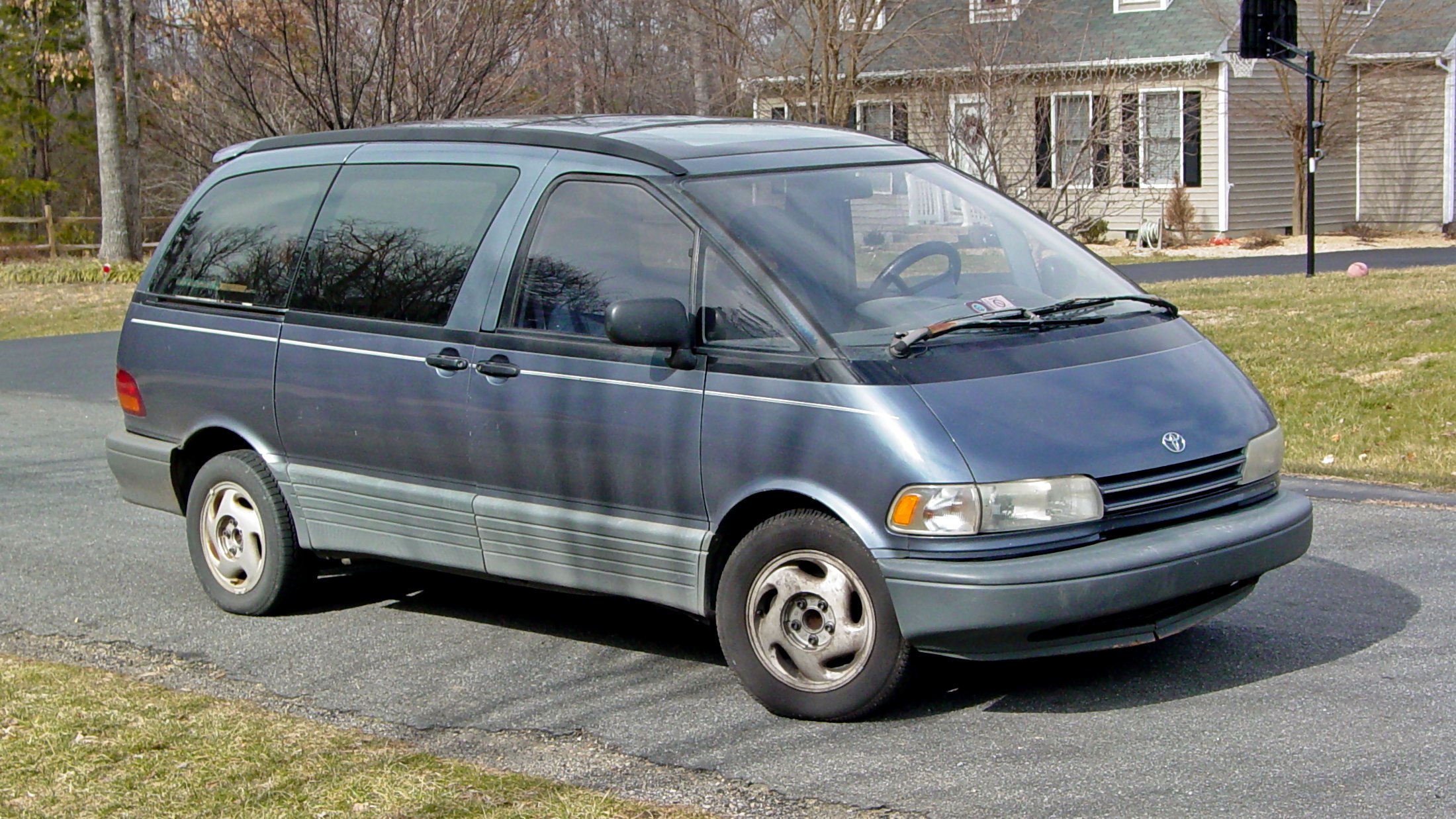
Then I went from railcars to the various cars that I have owned over the years, starting with the Previa. By now, I had also figured out that I had to be super specific in order to get good results. So I told it “Cadet blue 1991 Toyota Previa in the mountains” as a prompt, and this is what it spat back out at me:
")
")
")
")
First of all, “cadet blue” is the color that the real Previa was from an official standpoint, though at a casual glance, most would say that it looked gray. This is kind of a blue-green color. Not a bad color, but not the color that I expected. The vehicle shown here is also not a Previa. It is much closer to that of the original Toyota Van, which is the model that preceded the Previa. We had one of those as well, in brown, and we traded it in when we got the Previa. We didn’t have it for all that long (about three years), mainly because Mom didn’t like that it was a manual transmission.
Then I moved up to the Sable, asking for “Tan 2004 Mercury Sable station wagon in the parking lot at a Walmart store”:
")
")
")
")
Clearly, I imagined a specific time period for the Sable, that being its first year when I was taking it to Walmart every day for work. Why I picked Walmart, I don’t know, because Walmart is a job that I would like to forget, but there you go. It didn’t do too badly with the Sable, though. For the most part, it looks like the Sable used to look, though I had no roof rack (first image), I had no extension of the roof (third image), and no moon roof (fourth image). I do kind of like the second image, though, with that pattern on the paint and all.
Then I went on to the Soul:
")
")
")
")
Yeah, I went there. The exact prompt that I used was “Green 2012 Kia soul on fire on a rural road at night”. Then I decided it wasn’t fiery enough, so I ran it again with “Green 2012 Kia soul fully engulfed in flames on a rural road at night”, and got this:
")
")
")
")
Much better. Scary how much it looks like the real thing. About the only thing that I would do would be to add more flames coming out of the front of it, since the fire started in the engine compartment. The little fireball on wheels looks just like it did when we last saw each other: with flames coming out of it. But for as much as I loved that car in its day, there is no love for it anymore because of the way it ended.
Then I moved on to the original HR-V. That was a car that I grew to love, and I think that my AI prompts reflect that. I started with, “Honda HR-V driving in the sky”:
")
")
")
")
Then I went with “Dark gray 2018 Honda HR-V in heaven”:
")
")
")
")
And then finally, “Gray 2018 Honda HR-V in heaven with a cadet blue 1991 Toyota Previa, a tan 2004 Mercury Sable wagon, and a green 2012 Kia Soul” to complete the set:
")
")
")
")
I hope you can tell that I miss the original HR-V. The original HR-V was a good car, even if somewhat short-lived (through no fault of her own), and I wasn’t ready to say goodbye. Showing her ascending into the heavens, arriving there, and then joining the Previa, the Sable, and the Soul in automotive heaven seems to demonstrate that, and provide some level of closure. One can only imagine what the four vehicles would say about me, and all of the places that they took me to. The original HR-V and the Soul might talk about their trips to various rail divisions, and the Previa would reply, “Considering how many times I took him to Vienna and back from Stuarts Draft, it’s about time that he got into transportation!”
And then, before I hung it up for this session, my mind turned towards Today’s Special. You know, I had to. So I started out having it generate the store. So I put in “Hudson’s Bay Queen Street store in Toronto with a mannequin in the window” as a prompt, and it generated this:
")
")
")
")
I’ll say this: it doesn’t look like the store, but it’s also not bad, either. And the background looks the way that Toronto ought to look. I realize that if you’re really being a Today’s Special purist, the store was called Simpsons back then. However, here’s what happened when I put “Simpsons department store on Queen Street West in downtown Toronto” as the prompt:
")
")
")
")
Yeah. It produced those Simpsons, and not the Robert Simpson Company. Though admittedly, the buildings that it produced when I said “Simpsons”, despite being adorned with The Simpsons characters and such, actually resemble the store a lot more than when I said “Hudson’s Bay”.
I then did the main characters, starting with Jeff, i.e. “A male department store mannequin wearing a white shirt, gray pants, a red plaid vest, and a red plaid gatsby cap that is magic”:
")
")
")
")
Apparently, I described Jeff’s outfit fairly well, because looking at the results, the outfit resembles what Jeff wore on Today’s Special fairly closely. I consider the first one to be the best, as that rendition of Jeff is not wearing a tie. The second one is pretty good, too, though Jeff never wore a tie when he was wearing his standard Jeff outfit. The third one isn’t bad, either, though that’s not really a Jeff hat. The fourth one also gets Jeff’s outfit pretty well, save for the hat, which is something sort of resembling a fedora. I kind of like the glow on the mannequin’s right hand, which was how it interpreted the “magic” part of the prompt. Jeff himself never had any magical powers of his own, though. The hat had a magical spell on it that brought him to life, but that was about it. Though in all cases, seeing Jeff as an actual mannequin like that is a tad weird, since even on the two occasions when they used a real mannequin to represent Jeff (in the opening and in “Our Story Part 2”), it was a fairly realistic looking mannequin that they used.
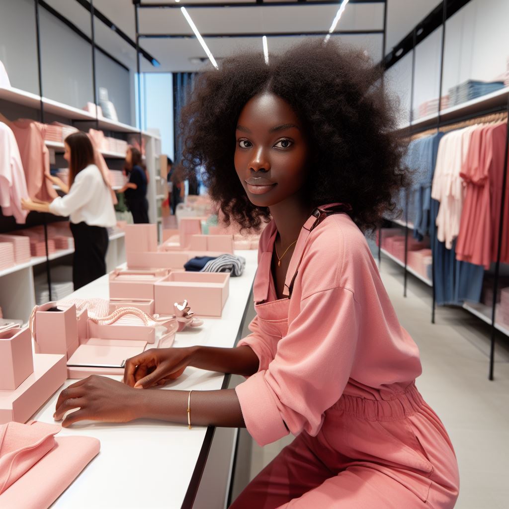
So what about Jodie? I put Jodie in as “A black woman wearing a pink jumpsuit setting up a display in a department store” and got this back:
")
")
")
You know, they didn’t do a bad job. None of these women look particularly like Jodie, but I think that the third image is the most Jodie-like as far as the outfit goes. The first and fourth ones are too low-cut, and while the second one looks good, the third one just seems to fit better.
Those were the human characters, but what about the puppet characters? I had to create Sam in AI as well, and the AI didn’t know that Sam was a puppet. I had to fiddle with it a little bit to get Sam the way I wanted, but the base prompt was “An older gentleman with a white mustache working as a department store security guard wearing a brown uniform”. Then I did a variation that attempted to add the Sam Browne belt that Sam sported with his uniform, and also one that specified Sam’s red spotted bow tie. Here was the base prompt:
")
")
This was generally the spread, showing our subject in a dress uniform or a more functional uniform. Sam generally wore a dress uniform when he was at the store, which makes the first image feel a bit more Sam-like.
Then here was the addition of the Sam Browne belt to the prompt:
")
")
I was a little disappointed that the AI didn’t know what a Sam Browne belt was, and instead gave me more of the same, but just a little bit further out than before in order to show a belt around their waist.
However, when I specified the red spotted bow tie, I got the best results:
")
")
")
")
The first and fourth images really did it for me. It felt like Sam as a human character rather than a puppet. The first image just has me with the hat, and then the fourth one, while lacking a hat, really nailed it with Sam’s uniform, minus the Sam Browne belt. I didn’t like the second and third images that much, as I thought that the shoulders didn’t look right on the second one, and on the third one, I thought that a bow tie on a more functional uniform just didn’t look right. Either way, though, I could definitely see the Sam in the first image saying, “Oh, fumblin’ fishcakes” or any other similar alliterative expression that one might expect Sam to say.
Then there was Muffy, i.e. “A female talking mouse wearing Mister Mousters jeans who lives in a department store”:
")
")
")
")
I admit that I was a bit disappointed about how Muffy came out. The first image looks too much like those Funko Pop toys rather than Muffy. The second image looks too much like anime. The third one looks too much like a fursuit (and in fact, I found a fursuit very similar to this on DeviantArt), even though I do love the hat. The fourth one is probably the least objectionable, but it still doesn’t particularly send me. But at least I could see that last one rhyming. The others, not so much.
Then there’s TXL, which I couldn’t figure out how to describe other than “TXL Series 4 computer”:
")
")
")
")
Yep, TXL is a laptop. I suppose that makes enough sense. That could have potential, though, with Sam’s carrying TXL around the store, rather than her just existing in the Computer Room.
I didn’t do Mrs. Pennypacker, mostly for lack of good terminology to describe her that would halfway look like Mrs. P. But I did then try to get some imagery of Jodie carrying Jeff like we saw in the opening credits. So I took the Jeff and Jodie prompts and mashed them together. My first attempt was “A black woman wearing a pink jumpsuit carrying a white male mannequin wearing a white shirt, gray pants, a red plaid vest, and a red plaid gatsby cap that is magic in a department store”. That produced this:
")
")
")
")
First of all, note that I forgot to change the uniform, since Jodie wore the brown uniform in the opening credits. Failing that, though, the first one kind of weirds me out. Jeff is clearly a mannequin here – even more so considering that he is gray. He is positioned to carry someone in his arms, and Jodie is in there, with her arms around his shoulders. Oh, and she’s wearing a magic hat, too. One has to wonder how that position came about for a photo-op. Did Jodie get Jeff to pick her up and then she removed his hat? Did Jodie put Jeff in position for the next day, remove his hat, and then hop into his arms for a photo? So many questions, and so few answers. The second image shows Jodie standing next to mannequin Jeff, and she’s holding a sparkler and wearing a hat similar to Jeff’s. Okay. She’s not carrying him, but at least there are no questions of any significance being raised. The third image also raises some questions. Why does Jeff, clearly a mannequin, have his arm around Jodie? What is that expression on Jeff’s face? And why does it look like they’re a couple? The fourth image, meanwhile, is about as close to what I intended as I could get on this particular run. Jodie is carrying Jeff through the store as a mannequin. Jodie is wearing a jumpsuit that seems to be a cross between her original pink uniform and her final uniform, with general styling like the first one, but with chest pockets and a collar resembling her final one. And except for the bow tie, the mannequin looks more or less like Jeff. We’ll go with it.
Finally, I fixed the prompt for Jodie’s uniform, running it as “A black woman wearing a brown bellhop uniform carrying a white male mannequin wearing a white shirt, gray pants, a red plaid vest, and a red plaid gatsby cap that is magic in a department store”. I described it as a bellhop uniform because when I was growing up, Mom always said that Jodie’s original uniform made her look like a bellhop, and I find it hard to argue with that description. So bellhop it is, and here’s what it turned out:
")
")
")
")
All I have to say is that the results were interesting. Regarding the first and third photos, my first reaction was, “When did Jodie start working at Cracker Barrel?” Seriously, a brown apron and a white shirt like that are what Cracker Barrel employees wear to work. Otherwise, the first photo, save for Jodie’s outfit, seems to be as close to Today’s Special as we got, as that version of Jodie has the hairstyle that she sported in the show’s early seasons, and that version of Jeff has realistic skintones, which makes him look the most Jeff-like out of the whole bunch. The second one is just a teensy weensy bit weird (though admittedly, they’re all a tad weird), with Jodie’s carrying Jeff, clearly as a mannequin, on a tray. Reminds me of the opening, where Sam says, “Need a hand with him, is he too heavy?” about carrying Jeff, and Jodie responded that she was good. I suspect that she might have needed a hand if she was carrying Jeff on a tray, because that has got to be an awkward way to carry something that size. The third one is kind of in the same vein as the image from above where mannequin Jeff is holding Jodie in his arms, though this one at least has the human carrying the mannequin, rather than the other way around, even though Jeff, as a mannequin, is clearly holding on while Jodie is carrying him. Then there’s not much to say about the fourth image, except that Jodie looks quite young, like she’s still in high school and she’s working at the store after school as her first job.
The whole exercise of using characters from Today’s Special gave me vibes of what Today’s Special might look like if it were rebooted not as a children’s show, but as a young adult drama with a touch of whimsy to it. Sort of like Superstore, but set in a department store rather than a big-box store, largely occurring overnight when the store is closed, and with a much more serious tone to it than either Today’s Special or Superstore.
But wait, this Journal entry wasn’t supposed to be about Today’s Special. It’s about AI. All in all, I had fun with this, as it imagined things in different ways than I had ever considered, it made some scarily accurate things, it got some things terribly (and hilariously) wrong, and it made for some fanciful settings as well. Like ChatGPT, it’s good for amusing your friends, but it’s definitely no substitute for real photographers and illustrators.
Categories: Afton Mountain, Artificial intelligence, Baltimore, Fire alarms, Honda HR-V (2018), JMU, Kia Soul, Mercury Sable, Stuarts Draft, Today's Special, Toyota Previa, Washington DC, WMATA