It’s time to refresh things, but what to do…
6 minute read
December 27, 2023, 9:30 AM
Those of you who have been familiar with this site know that it has looked largely the same since the fall of 2012, when I introduced the “Modern Blue” design of the site. That design was refined about eleven months later, creating “Modern Blue 2.0”, which smoothed out some rough edges of the original design and eliminated some stylistic holdovers from the previous design. Since August 2013, there have been minor modifications to the design here and there, but no substantial reworking of the design has occurred since then. That means that the site has been on Modern Blue in some form for more than eleven years – longer than I’ve had any site design. If it tells you anything, the longest-lived site design prior to this was the “Blue Squares” theme, which lasted for four years and three months. This blows that right out of the water.
The reason I want to change is twofold. First, the design feels like the work of a much younger man. I launched that design when I was 31 years old. I am now 42. It reflects what 31-year-old me thought was state of the art design, but now it feels a bit long in the tooth. There were also design choices made back then that I don’t think that I would do today if I were to do it all over again. Right offhand, the main page has some odd gaps in it that are the result of the way things of different lengths fit together. The main page has always been a launch page for the rest of the site, but it’s also not very tight in its design, and those flaws are baked right into the site’s design. Additionally, besides a design that is dated in appearance, the site’s theming is also a bit dated as far as things go under the hood. WordPress has changed considerably in that time, going from the TinyMCE editor to a new one called Gutenberg, and WordPress has also adopted blocks in a major way. I still use TinyMCE to write for Schumin Web, and my theme does not support blocks in any way because it predates their introduction.
All that said, Schumin Web is in need of a new theme, not only to update the look of the site, but also to extend its functionality. There is so much that I’m missing out on by not having a block theme, and I can’t help but think that my existing theme is now holding me back. Plus it’s time for a visual refresh, because while the whole content-in-boxes look is nice enough, its time has passed.
That said, there is a lot that I need to learn and figure out, both from a technical standpoint and a design standpoint before I can make a refresh a reality. First and foremost, on the technical side, I have to learn how to design a block theme for WordPress. I’ve designed legacy themes on several occasions for various properties of mine, but I’ve never designed a block theme. I know that block themes largely use HTML rather than PHP for their files, but when it comes to learning how to design one, I don’t know how much knowledge I need to bring to the table. Do I go in and build on my existing knowledge of legacy themes, or will I be best served to forget everything that I know about theme design and go in like I know nothing? I’ve tinkered with premade block themes here and there in the past, but that’s about the extent of my experience with it. And for Schumin Web, I have to have a custom theme. I have learned from experience that trying to adapt Schumin Web to a premade theme is more trouble than it is worth, and it is much easier to build a custom theme that is designed from the outset to hold Schumin Web content. So lots of research and testing to do there.
Then there’s the design side of things. I can learn how to build a theme, but that will only get me so far. There are lots of design decisions to be made, and those are ultimately things that only I can determine. It’s one thing to learn how to build a WordPress theme. It’s another thing entirely to build your own theme. Schumin Web, you see, is a very complicated beast. It has multiple tiers of navigation. It has multipart photo sets. It has several different custom post types (fire alarms, quote articles, photo features, and splash photos are designated as individual post types). All in all, it’s a lot to tackle. And Schumin Web has grown organically, which doesn’t always make things the most cohesive. All of that said, the complexity of this beast is a lot of the reason why there has never been a really good mobile-optimized version of the site: because I have no idea how to distill all of the various paths that the site goes down into a simple navigation schema that will be easy to follow on a “hamburger” menu. Ideally, I’d like it to look similar to the AMP versions of the Journal entries, but with navigation to allow users to easily hop around the entire website, and ideally, something that I can just build and forget about, i.e. when I add content for the desktop version, a mobile version just follows right along without my having to do anything extra. And let me tell you that a mobile-optimized version of the site is necessary these days. When I launched Modern Blue in 2012 at age 31, I could handle reading the desktop version on mobile without any issue. Now that it’s 2023 and I’m 42, even with those mature-people glasses with progressive lenses that I now have, that has become a taller ask as of late – at least not without zooming in considerably.
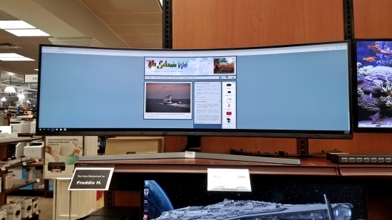
That also dovetails nicely with the other design issue: Schumin Web‘s current design is not very responsive. Right now, the site is at a fixed width, no matter how wide the screen is. Here’s why that is a problem:
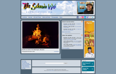
What you are looking at here is Schumin Web displayed in a maximized window on one of those ultra-wide gaming monitors that Micro Center had on display on October 14, 2017. There is a big field of blue, and a little tiny website sitting in the middle of that giant field. The website has all of that space to work with, and it uses maybe a third of it. Now, admittedly, this is an extreme case, since most people don’t have these ultra-wide gaming monitors, but it’s still an issue, even on a more reasonably-sized monitor. Here’s what it looks like in a maximized window at 1080p:
It’s less so than on that big gaming monitor, but it’s still a relatively narrow website sitting in a wide field. On longer pages, it gets even narrower, as the right sidebar ends when it’s done, and you end up with a content panel that sits slightly left of center. And the gaps in the design of the main page that I mentioned earlier are also quite evident, as there is a not-insignificant amount of dead space between the bottom of the content and the top of the footer. In any case, the site is not making good use of all of the space that it has available to it, and it doesn’t adapt well to different sizes. And really, modern websites should do their best to fill the screen, or at least go big and then degrade gracefully for smaller settings. On Schumin Web, it is very much a one-size-fits-none design right now.
All of that said, I suppose that I have my work cut out for me, learning how to build a WordPress block theme, coming up with a new design for the website that makes use of a block theme, and also solving some design issues that have stymied me in the process. It’s a big undertaking, but it’s a necessary undertaking.
Meanwhile, if you have any suggestions about what I should do to bring Schumin Web into the 2020s, let me know in the comments down below. If you can help me figure out a functional aspect of the site or suggest a new appearance for things, I would certainly be appreciative. The more ideas, the better.
Categories: Schumin Web meta


