


Walmart circa 2006…
7 minute read
November 15, 2022, 1:17 PM
Recently, a commenter on my post about the 2005 remodel of the Lexington Walmart remarked about the evolving interior of these stores. They said, “It’s so interesting seeing as this company is a backbone of America, but people barely document the constantly evolving exterior and interior of a place that millions of people visit every day.” It’s true. Walmart looks very different now than it did ten years ago, which is also very different from the way that it looked ten years before that. After all, ten years ago, in 2012, Walmart stores were mostly blue and yellow on the inside, as the Project Impact store design had been rolled out to most stores. Ten years before that, in 2002, Walmart stores mostly used a lot of blue and red, and had white or gray walls. What we think of when we think “Walmart” constantly is evolving. In the early 1990s, they used fairly simple red signage for departments. Then they switched to larger signage with patterns and photos on it. Then there was the black decor, and Walmart’s switch soon after from red, gray, white, and blue to a brown color palette. Then there was the era of the large wall signs, with small signs that looked like pylons scattered throughout the rest of the store. Then there was a short-lived variation on that wall-signs package that incorporated the new logo. Then there was Project Impact\, which was rolled out in a very concerted effort chainwide, and really made use of the new logo on everything. Project Impact was surprisingly long-lived, with some stores’ being remodeled to the design twice. Then there was another design that we called “Black 2.0” which was fairly minimalistic, and now uses a much warmer color palette and lots of signage.
All of this serves as something of a reminder that what was considered cutting edge one day is considered vintage or otherwise outdated later on. Back in 2006, when I still worked at Walmart, the company had announced their newest store prototype, which had a completely different signage package than my store had, and looked quite flashy for the time, and represented the latest attempt by Walmart, a pretty lowbrow company, to try to convince people that it’s highbrow. I later learned that the Walmart in Culpeper was being remodeled, and was getting this new store design. So on Sunday, September 17, a day that I was off of work from my own store, I headed up to Culpeper to see what it looked like and document it, because I’m a bit of a nerd like that.
For background, the Culpeper location is store #2136, a pylon-style purpose-built Supercenter that opened on January 25, 1995, and was the first Supercenter to open in Virginia. As such, it would have had the red signage originally, and by the time I visited, it had been remodeled once, likely in the early 2000s, to the following generation of store design. When I first visited in 2005, it looked like this:

The front end.

Grocery action alley, facing the front of the store.

Grocery action alley, facing the rear of the store. Note that the lighting was changed from high-bay to fluorescent between when I shot the first two photos and the rest.

Back action alley. Note that the carpet had been pulled out of the softlines areas and replaced with the fake wood flooring, though the red floor stripe around the softlines area remained.

Left-side action alley.


The in-store restaurant was called “Gingy’s Pop Shop”. I had only ever seen this concept here, and this was during a time when Walmart was phasing out the in-house snack bar operations in favor of outsourced businesses like McDonald’s.
(And for those wondering, yes, these photos are potato quality, because they were taken with my original LG camera phone from 2004, and that was the state of things as far as cell phones went back then.)
Then in the summer of 2006, I discovered that Walmart was remodeling the store in Culpeper when I was passing through, giving it a new color scheme in and out, and going to the latest decor package. I suspected that it would be similar to what was first shown off in an issue of Wal-Mart World earlier that year in an article about their latest, most modern store design. This trip in September was to see the result now that the remodel had finished.

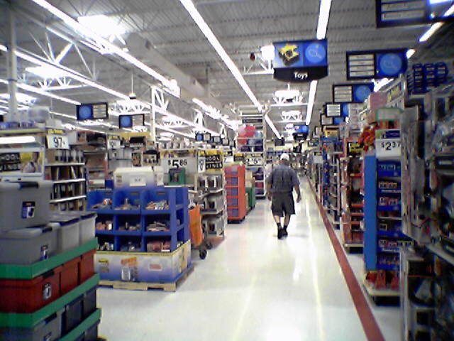
Front left corner of the action alley, in front of the general merchandise entrance.

Grocery action alley, facing the rear of the store.

Grocery action alley, facing the front of the store.

Deli area, with new wall signage above it. This is an older store, so the service deli is in the back.
 and produce (right) areas, at the front of the store.")
Bakery (left) and produce (right) areas, at the front of the store.

Aisle down the middle of the clothing area. Note that the red stripes on the floor are now gone.

Wall signage for the pet department, with racks of Halloween costumes in front.

Health and beauty section, with the big wall sign in back, and the little pylon signs over the aisles. I found the little pylon signs to be less than helpful, mainly because they were small, and the text was hard to read, with its being printed in white on a light surface, not being very bold, and being oriented vertically. I ended up ignoring those signs completely and navigating without them.

One of the aisles in the toy department. Note that the in-aisle signage that was introduced in the previous generation of signage was retained, though it is now in a lighter color.

Aisle in the stationery department.


The checkouts in front. These black cash wraps were new, and were consistent with the style that Walmart was using at the time, replacing older versions that were similar in design but a dark powder blue color. The register numbers, however, were something that I only ever saw at this store, which makes me think that Walmart was testing this smaller triangular design here, and ultimately decided not to implement it on a larger scale. Normally, the register numbers that went with this design were the box-style ones that they had been using, in black. Walmart later went to a dark blue color for the box-style numbers, and then reduced the size of the boxes with Project Impact.
All in all, this particular store design was something of a disappointment for me. It looked really sharp when Walmart put it out in Wal-Mart World, but I was not very impressed with the design in real life. This version was a little too minimalistic with the signage where it shouldn’t have been, and it put too much value on the big wall signage, which, in the end, made the store a bit difficult to navigate. As is often the case with Walmart store designs, there was something of a disconnect between the design in the grocery section and the rest of the store, as grocery was very easy to navigate with signage that was quite easy to read, while we had to suffer through those awful little hanging pylons elsewhere as we attempted to navigate the store. Thankfully, this particular store design was relatively short-lived, as Walmart had moved onto a new signage package with the introduction of the new logo in 2008, and then completely revamped the store interiors with Project Impact shortly after that. Project Impact was much easier to navigate compared to its two immediate predecessors, but with its blue and yellow colors, it looked a bit gaudy, and gave Supercenters a bit of a split identity, with the grocery and general merchandise areas’ looking very different from each other. The current design being rolled out to stores also has different design elements in grocery vs. general merchandise, but while the walls in the grocery section look really sharp, the general merchandise section looks a bit half-hearted by comparison.
Meanwhile, Culpeper is now on the “Black 2.0” design, which is the one that immediately followed Project Impact. The exterior is now gray and blue, consistent with the store design standards from that period.