


Time to redefine my look…
7 minute read
May 11, 2016, 8:59 PM
…and by that, I mean it’s time for new glasses. I’ve worn glasses since January 2001, and I’ve had four pairs of glasses since then. The first pair, which I had from 2001 to 2005, had wire frames and more or less round lenses. Then the second pair, from 2005 to 2008, had squarer lenses with really round corners. I had my next pair for only two years, 2008 to 2010. Those continued the squaring trend, with corners less round than before, but still a bit of curve in them. My current pair, since 2010, is another evolution in the same vein, with fewer curves and more squareness, plus more definition on the sides. It’s funny, though – with that last pair, I picked the antique finish on the frames. However, after almost six years of use, I think it’s now closer to a silver finish than antique. So even though my prescription barely changed, it was time for new glasses.
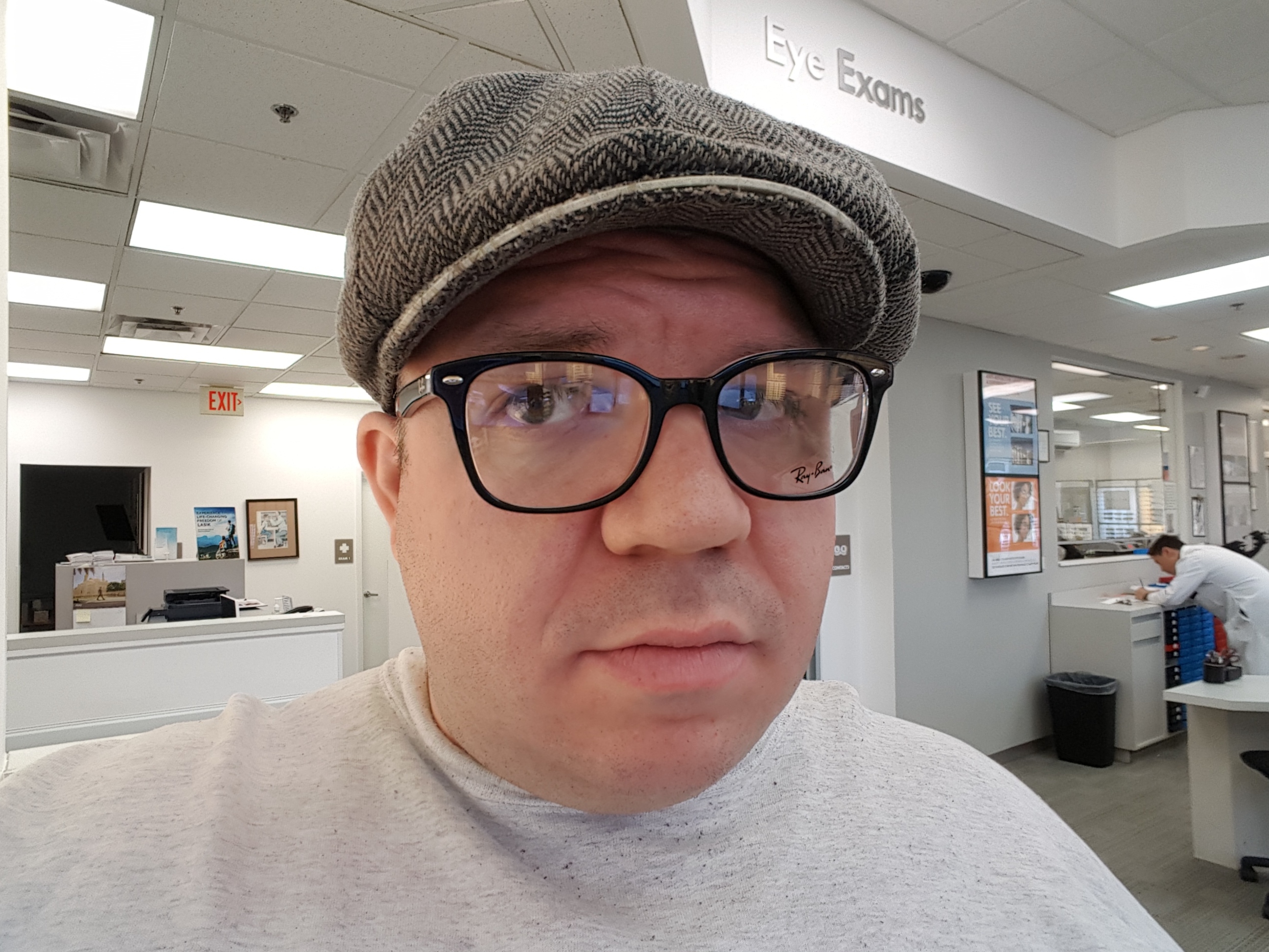
I had actually been looking forward to my eye exam last week for quite some time, because I was tired of my existing glasses. Therefore, I had taken plenty of time to think about what I wanted to do on my next pair. I figured that if I didn’t do something significantly different, then I would probably do another evolution on what I was doing now. However, the latter would essentially be an admission of defeat for a new style, and I didn’t want to do that. So with a new prescription in hand, I went and tried out a bunch of different glasses to see what I liked.
My first stop was Lenscrafters, and my first test was this pair:

Not bad, eh? However, a look inside was a dealbreaker for me:

That green color. No. Just no. I just couldn’t get behind that, even if it was only on “my” side of the glasses. I knew it was there, and that was more than enough. But other than that green, they looked all right, I suppose. Moving along…

These were along the same vein as the first pair, but didn’t have that ugly green. These also had metal sides, unlike the first. Not bad?
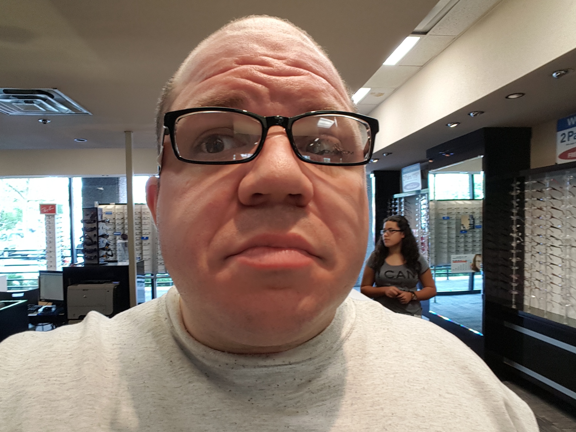
Then the next pair was the logical evolution of my existing style:

I think my expression says it all, don’t you think? Not impressed. The style hasn’t really evolved much, just going darker. This also sealed the deal against going for the evolution of my current style. Yes, it looks like something I would do, but I’m tired of it. What was “we have a winner!” in 2010 is now a no-go in 2016. Ben at almost 35 says “no” to 29-year-old Ben’s glasses.
Then there were these:


This is a step in a direction that I was not expecting, but was surprised to find that it didn’t look too bad. These glasses are burgundy, i.e. a really dark red bordering on maroon, but not quite maroon. Here’s a better look at the color:

That is definitely a departure from my current glasses as far as color goes, as I’ve had antique finishes for the last fifteen years.
Next, I tried these, from Ray-Ban:


These are similar to the others, except that they have a more flared top. These certainly have potential.
Then these had an even more defined top:

Once I put these frames on, I thought, “How nineties.” Seriously, a person wearing those glasses should then sit down in front of a computer that looks like this. I like to think that I am way cooler than that.
I also went over to Visionworks, which is similar to Lenscrafters, and tried on some more:


These also have potential, with thinner frames, but still a big departure from my current glasses.
Also, did you know that Caterpillar, as in the company that makes heavy equipment, also has branded eyewear? Check it out:


Caterpillar-branded glasses. I kid you not. But I wasn’t a fan.
Then there were these:

Clear frames. Yeah. No way.
These were interesting:


These were all right, however, they had a major problem. Specifically, I saw myself in these, and immediately thought of Lane Brooks, my old boss from Food & Water Watch. You may recall that this is the person who caused me quite a bit of unnecessary stress while trying to get rid of me in 2013, so we’re not exactly buddy-buddy. Lane Brooks is someone whom I’d rather not be reminded of every day when I put my glasses on, and I’m sure that most people who meet him would probably rather forget him as well. Needless to say, these hit the “no” pile pretty quickly.
Then there were these:


These were okay, except the addition of nose pads made them look like they were floating, vs. the other ones of this style that sat directly on my nose.
I also hit up America’s Best Contacts & Eyeglasses for some more selection. Here we are:

I don’t know quite what these were supposed to resemble on the top half. Stone, perhaps?
Then these were worth a laugh:


That bottom image in particular looks like something that you would see a cartoon character wearing. I’d like to know what sane person would actually purchase and wear those glasses, because those are ugly. I mean, seriously, tinted on the sides and clear in the middle?
Then these had potential:

Not bad, if you ask me.
However, I did tend to get an overall negative feeling about America’s Best Contacts & Eyeglasses. Most of the glasses that I tried on just felt flimsy, and I wasn’t sure if they would stand up to normal usage. After all, I do occasionally hook my glasses on things and then fling them off, not realizing that I had hooked them on something (whoops). I wasn’t confident that they would do well after something like that. Considering that these glasses only cost half of what the other two stores were selling for, I guess you get what you pay for.
It’s also a lesson that if a place has to tell you that it’s the best, it’s usually not. The best places usually demonstrate it by just being the best, without having to broadcast it. Just like there’s this place called “America’s Best Wings“, which is a Maryland-based chain of chicken wing and sandwich shops. They are not the best food around by any means, and their name is so easy to make fun of, too. I’ve called them all of the following:
- America’s Worst Wings
- America’s Average Wings
- America’s Mediocre Wings
- America’s So-So Wings
- America’s “Eh” Wings
- America’s “Just Okay” Wings
- America’s Mildly Pleasing Wings
And like I said, their food is by no means spectacular, or even particularly noteworthy. Basically, if you have to tell me that you’re the best, or that you’re better than someone else, you’re almost definitely not.
In any case, let me know what you think of the different styles of glasses. I’m still a bit up in the air about what style to go with. The burgundy ones from Lenscrafters are certainly nice, as is the first one from Visionworks. Plus I’m willing to be convinced about some of the others as well. Leave a comment, and let me know! I will probably settle on one and take that plunge towards the end of the week.
Categories: Glasses