


Look at what I unearthed…
4 minute read
December 24, 2013, 11:22 PM
So I was digging around in the Internet Archive Wayback Machine tracking down some missing text for Project TXL (the Today’s Special site revamp), and I ended up finding this gem from approximately December 1, 1999:

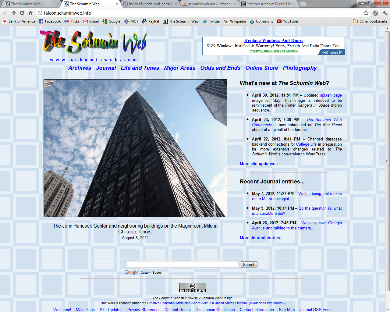
Though I’m guessing that this is probably much closer to the way that 18-year-old me intended for it to look:

Um. Wow. Next time someone asks how much I’ve grown and matured since I was a teenager, I’m showing them this. Let’s take a look at what’s wrong with this design.
Right offhand, look at that background. Just look at that. I was going through a rainbow phase in 1999, and there it is. That’s a lot of color. And the hues in the background don’t really harmonize with the logo. Not at all, actually. I think that the background competes with the logo to the point that the logo doesn’t stand out. Also notice how it does not flow gracefully into itself when tiled. I believe that this was possibly around the time when I discovered how to make backgrounds static, and so as far as I was concerned, it didn’t matter that the background image didn’t gracefully flow into itself vertically, because, hey, I could make the background freeze in one spot. Clearly, I had never thought that anyone would ever view the website on a higher resolution display. Now mind you, in 1999, 1080p did not yet exist, but still, that’s a really kludgy move right there. I’d guess that the thought process there was that no one would ever see that seam, and therefore, it didn’t matter. My most recent background, the squares, harmonized all the way down the page.
The photo of me is a professional photo from my senior pictures in 1998. I used that photo as my main photo for about two years. Using a photo for that long would be unthinkable today, as I now like to rotate out the photo of me on a monthly basis. Plus since it’s a professional photo, it meant that I didn’t hold the copyright to it. No one ever said a word about it, though they could have, and they would have been right. Plus it’s really bad practice to use a photo that someone else owns the copyright to as a significant part of the design without getting explicit permission for that usage. However, that’s not the only improper image usage. The background image was stolen, too, and I apologize to whoever designed that background for what my 18-year-old self did, using it without asking and all that. I don’t even have any record of who designed it in the first place, but I know that I definitely didn’t make it. These days, I know how to do my own graphics.
I also used frames in this design for my 404 error page. How nineties. I believe that the left frame contained a menu with links to all of the various parts of the website, though that didn’t come through on the archive. I believe that frames were considered a good idea for about thirty seconds, and then we all realized that there were far better ways to design websites than by using big, clunky framesets.
Then there’s the font. That is Comic Sans right there. Yes, that Comic Sans. 32-year-old me would tell 18-year-old me that Comic Sans is a major design no-no. Of course, 18-year-old me also thought that he knew everything, and therefore probably would listen to that advice and then do what he wanted anyway. Yeah, I was a bit stubborn. The thought process probably would have been, “Thank you for your input, but it’s my website, so I’ll design it the way I want.”
Notwithstanding the hideous choice of font, the text is completely unnecessary. I went on for two paragraphs to more or less say, “What you said did not compute.” Even back then, one only had to spend about ten minutes on the Internet, and one would discover that 404 = not found. Not only did I make the initial declaration (in a cute 411-operator sort of way), but then I went on for six sentences to explain all of this. Then I gave a link to the contact page. Then I went on in the next paragraph to tell people to look around the site. By comparison, my current 404 error page has a photo showing me holding a monkey wrench, and says, “404 – Not Found” and “What you said did not compute.”
The header part suffers from a bit of early installment weirdness. The current logo had been introduced earlier that year, but note the white fringe around it. It’s not a clean edge at all, and it indicates poor processing on my part. That fringe definitely should not have been there if I had done everything correctly. Then the “404 Error – Not Found” text is in the same font, color, and style as the logo, and also suffers from the “fringe” problem. These days, I would never do any supporting elements in the exact style of the logo. The only thing in the design that is in the style of the logo is the logo, and everything else should harmonize with it.
Looking at it all now, do you know what most amazing thing about this design is? It’s that, when you consider that I let this design go out the door in the first place, it meant that I thought that this design looked good. Looking back at this, I believe that the only reason that I thought this looked good was because I didn’t know any better, and didn’t realize how hideous it was.
Of course, you must realize that 14 years from now, I will probably say the same thing about Modern Blue 2.0, which is the name of the current version of the site’s theme. Such is how things work, after all. I learn new things and refine my methods, and that ends up raising my design standards. Not bad at all.
But in any event, I’m glad that this old design is in my past, and that is where it will stay.
Categories: Schumin Web meta