If the name of the development consists of the name of the station that the development is next to, and then they show a photo of the wrong station in their advertisement, what does that say about them?
June 25, 2008, 7:36 PM
Anyone who’s been through Fort Totten station on Metro’s Red Line has probably seen Fort Totten Station, the development of cheaply-built (they’re built of wood, not concrete) alleged luxury apartments contributing to the gentrification of DC. I go by them twice a day every day on my way to and from the office.
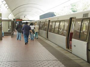
And the company that operates the development also runs advertisements in the Express. And they made a big boo-boo in their ad here. Let me show you what I’m talking about from today’s Express:

Photo: June 25, 2008 edition of Express, page 8
Is this Fort Totten station? No. Is this station on a line that goes to Fort Totten? No. Is this station of the same basic style so we can at least just pretend it’s Fort Totten? No. This is Clarendon, boys and girls. And Clarendon is on the Orange Line. You probably can’t read it in this photo, but “Clarendon” is easily read on a wall plaque on the Vienna side in the back of the shot. And the train has “ORANGE” in the door sign. They say, “Living thisclose to three Metro lines,” in their ad, and they didn’t even pick one of the three (out of five total) that goes there.
See, Fort Totten station looks like this:
Fort Totten is an above-ground transfer station, as you can see.
And additionally, the photo in the ad isn’t even a recent photo. Based on the items in the photo, it looks like it was taken in 2001 or earlier. The reason you can tell is not due to the presence or non-presence of PIDS screens, or even the train. Yes, that is a Breda 2000-series or 3000-series train prior to rehab, but some 3000s lasted into this year before going in for rehab. Then as for PIDS, it appears that the photo was shot either at or in front of the location of the PIDS screens, so they would be either behind the camera entirely, or out of frame. The kicker is the waste receptacles on the platform (look along the walls). Metro removed all of their existing trash cans and newspaper bins from within fare control in the period immediately following 9/11. New bomb-containment trash cans didn’t start appearing within fare control until 2005, and they are (A) large, (B) freestanding, and (C) have a lid.
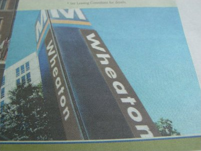
This whole thing reminds me of another glaring mistake in an advertisement in Express from back in 2005. This one was again for housing, this time around Wheaton station, likely The Glen, managed by Bozzuto. What is wrong with this picture?

Photo: April 27, 2005 issue of Express (my photo of the ad in question)
First of all, that’s an awful photoshop job on the pylon. Even Metro, which couldn’t stick to a bus schedule if its life depended on it, can get the writing to look the same on the different sides of the pylon. Here, “Wheaton” is far bigger and longer on the right side than on the left. And the real pylons say “Station” on them as well. But notice the rings around the neck of that pylon? Do they look blue and orange to you? Wheaton is about as Red Line as you can get. Any redder and you’d be at Glenmont. Blue and Orange don’t go anywhere near Wheaton.
I guess the moral of this story is, if you’re going to lie in the first place, and try to pass off one station as another, please at least try to make it look like the station you want us to think we’re looking at. It says a lot about a company that doesn’t pay attention to details when trying to pitch itself to potential customers…
Song: "Celestial Soda Pop" by Ray Lynch
Quote: You know, this whole attention-to-detail thing isn't just for advertising products or services. You've heard the old saying that employers throw your resume away if they see a spelling error or typo? It cuts both ways there. When I was looking at job advertisements, I wouldn't give so much as the time of day for an organization where the advertisements had typos or spelling errors. After all, do you really want to work for an organization that won't even bother to check its copy before it sends it out? I'd be pulling the rest of my hair out, I'd say.
Categories: Advertising, WMATA


